Intermarkets' Privacy Policy
Donate to Ace of Spades HQ!
aceofspadeshq at gee mail.com
Buck:
buck.throckmorton at protonmail.com
CBD:
cbd at cutjibnewsletter.com
joe mannix:
mannix2024 at proton.me
MisHum:
petmorons at gee mail.com
J.J. Sefton:
sefton at cutjibnewsletter.com
I Think That I Will Never See A Poem As Lovely As The ONT
Fri-Yay! Cafe
The Week in Woke
Democrats Recruited Antifa As their Zombie Street Enforcers.
Now the Antifa Zombies Are Running the Show.
Elon Musk Posts Entire Film "Citizen Vigilante"
As Evidence of Gavin Newsom's Corruption Grows, He Placates the Left By Announcing He'll Support a Communist Seizure of the Estates of His Rich Enemies
Former Colorado DNA Analyst Pleads Guitly to Manipulating Evidence
Denmark's Left-Wing Government Plans to Ban the Islamic Call to Prayer, Saying That Parts of Denmark Feel Like "a Suburb of Islamabad"
DHS General Counsel: It's Closing Time. Haitians Don't Have to Go Home, But They Can't Stay Here
Jon Ekdahl 2026
Jay Guevara 2025
Jim Sunk New Dawn 2025
Jewells45 2025
Bandersnatch 2024
GnuBreed 2024
Captain Hate 2023
moon_over_vermont 2023
westminsterdogshow 2023
Ann Wilson(Empire1) 2022
Dave In Texas 2022
Jesse in D.C. 2022
OregonMuse 2022
redc1c4 2021
Tami 2021
Chavez the Hugo 2020
Ibguy 2020
Rickl 2019
Joffen 2014
maildrop62 at proton dot me
Texas MoMe 2026: 10/16/2026-10/17/2026 Corsicana,TX
Contact Ben Had for info
New Logo
Well, it served me well, but the old death-card:
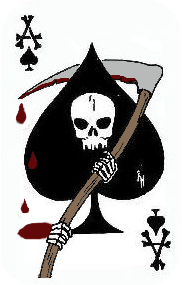
had to be retired, for a couple of reasons. First, I thought the skull was too small and, well, a little goofy-looking. Second, I sort of want to sell t-shirts, and I couldn't track down whether that image was still copyrighted; I decided to err on the side of caution and get a new design. Third, it was a little too smallish in its details to look good on a t-shirt anyway. Those skeletal hands... always figured out they'd wind up looking like Snoopy's paws.
Riehl World View did the original death card for me, basing it off an old Vietnam-era death-card. Great design, of course, and I miss that connection with real military history... but there are lawsuits to consider. Plus, I wanted a more classically piratical design, to go along with the killer Mencken quote.
I asked George from Snapshot to design me a skull-and-crossed swords design, swords behind the skull to fit on the ace. I also asked him, "Make the eyes both look vaguely menacing and vaguely jovial." That's a pretty hard thing to accomplish, but George nailed it on the first try.
Cool swords, too. You have no idea the f'n' exasperation I put him through over those swords. I swear, I had him try out every possible blade and hilt combination from a Scottish Claymore to a +3 Flame Tongue.
George was busy with business or family this past week -- or perhaps he went crazy from my annoying and constant suggestions for minor changes in the design -- and I asked Riehl World View to come in and pitch relief and finish the design up-- shrinking down one larger-than-the-other hilt, adding some blood to the blade, making the double-curved Arab-esque blade look a little more realistic, superimposing it on an ace, and adding it to a new banner with a crisper look. He knocked the whole thing together, beautifully I think, in two days.
And boy, you have no idea the problems I gave Riehl World over the blood.
Now, there's some loose shit going on with the page-borders and stuff-- yeah, I know, the BlogAds creep up into the banner, and I've got to fix the background color to match the slightly different gray Riehl World used -- but I've contacted Web Diva to try to get that all up to snuff, so the site should be looking like it has integrity again pretty soon. And cooler, I think.
Thanks so much to Snapshot and Riehl World View for putting up with my annoying demands. I'm a real taskmaster-- or, should I say, quartermaster, arrrgghh -- and they put up with more of my bullshit than any human should be expected to. As Riehl World told me tonight, "It's a good thing you ain't married yet, or you'd be dead already."
The new card isn't a perfect duplicate of a Vietnam-era death-card, of course, but it's similar in the basics to ones used by the military. This, for example, is one I found on-line, used by troops in Iraq:
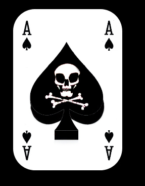
Cool, yeah, but... I like George's skull a lot better. And to hell with crossed bones. You can't slit a throat with a bone. At least not without a lot of wasted effort.
Anyway, that's the new logo. I love it. I hope you guys like it too.
Aaarrhhh.
Loose Shit That Will Be Straightened Out: For now, the logo is a work in progress. I'm going to lose the blood -- too garish, plus it obscures the cool shape of that sword -- and I'll move those little "A's" in the corner so that they don't conflict with the logo, or ditch them entirely.
And yes-- the BlogAds overlap with the logo, and the background/border is now the wrong shade of gray.
Web-Diva has been alerted!
Not to whiz in yer cheerios Ace, but it's a bit "Raider Nation" dontcha think? Which is ok if your target audience is a bunch of Mad Max wannabees from Oakland.
I guess it's a good thing I listened to George and didn't go with the eyepatch.
Raider Nation? Well, it is a pirate emblem. There are going to be some design similarities.
The only really distinctive jolly roger belonged to Blackbeard, and that looked, how shall I put this, gay.
I like the new death card, ace, but you're gonna have to work on the banner at the top of the site. The gray on the right hand part of the screen is lighter, and your blogads overlap the death card. (At least when viewed in Firefox.)
I know.... Riehl World and I tried to fix that, but it looks like I'll have to go back to Web-Diva.
A "+3 Flame Tongue?" Paging Hugh Grant -- ! :)
I liked the original droplets-of-blood thing.
Honestly, I like the two alternate skulls better too. This one just looks, well, puffy. Too big relative to everything else.
Plus the 'A' is teeny.
I agree with "someone" vis a vis the proportions. I think a taller skinnier spade behind the skull would balance better. I also prefer the stylized one in your first death card.
Glad to hear you're gonna lose the blood ... seems a little eighth grade to me ...
good job overall!
p.s. Glad to see the window title back. For a while there when I minimized (god forbid) the AceHQ window, it would read "no server found" even though it was there ..
Gotta have some blood....with droplets! If it ain't on the shirts I buy (and I will), I'm gonna add blood.
Just my opinion, so take it for what it's worth...
1) The coolest thing (to me) about the old death card was the A's made out of crossed bones. That's attention to detail! Have you considered incorporating that into your new logo?
2) The Army's Iraq Death Card is lame. Is it just me or does the skull make it look like we are killing "Alien Gray's" rather than terrorists? Calling Agents Scully ans Mulder....
Nice swords, Ace. What are they, 1d8s?
a Tampa bay Bucs fan?
seriously though, I'd lose the blood, and I was a fan of the crossed bones to make A's, of course that detail might not make it to a tshirt
and, of course, it's your website, so feel free to ignore this
The whole pirate/swashbuckling theme is simply fabulous.
I think it rocks. George and Riehl World did a great job.
Hmmm...
How about a set of crossed M16s instead of swords? High capacity magazines of course.
Just a thought. I enjoy your site, thanks.
I like the new skull.
1) blood gotta go
2) Skull is way too big, cheekbones are too prominent
3) bad swords, very Pirates of Penzance (they suggest farce) how about Roman Short Swords or Bastard Swords?
4) Lines are too thick, especially swords
5) Menacing is good, jovial is bad, SKULLS DONT SMILE!
ACE - PS
Roman Short Swords with a glint of steel on one blade would be very cool!
(Find examples of Roman short sword at Galati International)
I LIKE IT!
Even with the upcoming edits, you done good.
Now, let's stop yappin', and let's start slittin' throats. . .
Cheers,
Dave at Garfield Ridge
IT NEEDS TO BE FIXED!
In addition to everything else the shape of the card is not like that of a playing card, its too short and fat.
Glinting Roman Short Swords!
I like it a lot - I agree with removing the blood.
The overlap may be due to the fact that your banner height in the template doesn't equal the size of the graphic, if that makes sense.
The HTML is in your style sheet form - and should look like this:
#banner {
font-family: Verdana, Arial, sans-serif;
color: #FFFFFF;
background-color: #999999;
text-align: left;
padding: 0px;
border-bottom: 1px solid #FFFFFF;
height: 148px;
}
At the bottom, just change the height of the banner to match the height of your image, and that might work.
If not, I owe you a beer.
Also, appropriately enough, your banner (background?) color is #666666
Heh.
I see, with relief, that you're going to lose the blood. Thanks. It looks, er, um, well, sorry, dorky, and not especially blood-like.
Now a trailing splatter, as from cast-off, that might work, but the swathe, no.
Like the new skull, more of a menacing face and all, though think the A's in the corner need to stay - makes it more 'cardsy,' which is more right.
But, somewhat OT, as long as Web Diva is gonna be doing a droppin by, how bout adding a little 'show comments right here' thing ala Wizbang, maybe having them pop up on the same gray background here, while your post remains in white? Maybe it's just me, but I really dig that feature. A lot. Makes it easier to skim and read the comments. Quicker to get to, and cause their space allotment is as wide as the post, just easier to read.
Also, width wise (and because you asked), what's up with the right 1/3 screen being blank white and all. Thinking of adding on a patio over there or something? (Sunroom?). Let's get a bit more hoizontal, webpage speaking. Again, I only offer my opinions because they're mine (and therefore super-geniusy) and they'd make commenting/reading em' (which is where a lot of the fun is here) smoooother.
Yeah, the blood... okay, I wanted blood because I liked it on the old death card, but it just doesn't seem to work here, and it really screws up the starkness of the black-and-white logo.
someone seems to want blood, but I tell you, it's going to be an obtrusive bit of red on a stark black-and-white logo, and it's not going to look right, no matter what form it takes.
Maybe later I'll do an alternate design where there's blood splattered on the card -- not as part of the logo, but as if the death-card were actually sprayed with blood during a firefight or something -- but not now.
Other problems:
2) Skull is way too big, cheekbones are too prominent
-- eh. It's a handsome skull. I don't have good cheekbones, so I will compensate with a very Nordic skull.
3) bad swords, very Pirates of Penzance (they suggest farce) how about Roman Short Swords or Bastard Swords?
-- Get out of here. One is a cutlass, the classic pirate weapon, the other is a sort-of cutlass/saber with an Arabesque tip. Maybe you can't see that now.
One of Riehl world's early suggestions was a pair of what were either 18th century short swords or maybe 19th century dress cavalry sabers. It looked okay, but the swords aren't from the right period.
Obviously, neither are Roman gladii or bastard swords.
4) Lines are too thick, especially swords
Eh... I don't think so. I kind of like it. But I understand tastes may differ. You have to bear in mind that this has to look clear and good at differing resolutions.
5) Menacing is good, jovial is bad, SKULLS DONT SMILE!
-- Hm? Many Jolly Rogers featured a smiling skull. The Happy Dead and all.
Re: Taller, more slender ace
I'll ask Riehl about this. That's what I originally wanted, but I have to admit that the fat, short ace actually seems to work with this particular skull.
But, somewhat OT, as long as Web Diva is gonna be doing a droppin by, how bout adding a little 'show comments right here' thing ala Wizbang, maybe having them pop up on the same gray background here, while your post remains in white? Maybe it's just me, but I really dig that feature. A lot. Makes it easier to skim and read the comments. Quicker to get to, and cause their space allotment is as wide as the post, just easier to read.
-- I want Web Diva to make some changes, and I'll ask her about this one. Some things are difficult to achieve on Moveable Type, though.
Don't ask me which ones. Although I do know about one...
Also, width wise (and because you asked), what's up with the right 1/3 screen being blank white and all. Thinking of adding on a patio over there or something? (Sunroom?). Let's get a bit more hoizontal, webpage speaking. Again, I only offer my opinions because they're mine (and therefore super-geniusy) and they'd make commenting/reading em' (which is where a lot of the fun is here) smoooother.
-- Okay, I want to have a right sidebar. But it's hard to do with MT, I'm told.
The reason there's so much wasted space on the right side of your screen is because you're viewing it in a higher resolution, bigger screen I mean, whatever, than the design was made for.
There's no very good way to avoid this, I think. Either I will make the site look good for your resolution -- but there will be a buttload of wasted space -- or else people viewing it at lower resolution will have to use the bottom scrollbar to move across the full page (which won't display in full at a lower res), and that, I think, is a bit worse.
I don't know. Maybe at this point the bigger-screen readers are a big majority.
Are you? I don't know. I could try polling, but it would be unscientific.
As far as the 'show comments right here' thing, I just realized you already kinda have this. When you click on 'view' of a comment over under 'recent comments' the comments all pop up for the thread pretty much exactly as I was hoping for. I'd just use that, except you can't really tell which comment thread is gonna be opening unless you're able to figure it out from the snippet of their comment shown. In short, if you can make that exact thing open by some button underneath the particular post (keeping the rest of your posts scrollable on same screen), that's exactly what I'm looking for.
As far as the width thing, yeah, I think I'm using a higher resolution. That's really not any big deal to me. I was probably just more curious as to why the right part was blank to me; don't seem to run into that on other political sites I visit. I wouldn't blow any of that big blog ad money to fix.
Well, first of all, I could use the space for a premium ad or whatnot, as others do, and then put the comments underneath it so they're not so far down the page and stuff, so I don't mind spending money to get it done.
But I'm told that 3-column on MT is a bitch, almost impossible, and maybe there's no way to do it without having low-res viewers have to scroll across the page.
Which is something advertisers don't want either, of course, because everyone will just scroll their ads off the page entirely.
ACE - There is something dorky about the Pirate motif, it does suggest farce, (a long way from the Death's Head Skull and Runes of the SS - no fooling around there).
I just don't understand why a website dedicated to the proposition that all Liberals are created equally defective would want a goofy, pleasant, smiling Jolly Roger schtick?
Ann Coulter is right: it really is all Liberals' fault. They don't deserve smiling, welcoming, "inclusive" skulls, they deserve the spirit (and parody) of the SS!
Nazi Death's Head and Glinting Roman Short Swords!
uhhh... Nazi SS death-head you say?
Ummmm... well, look, there's little question that history's bad guys usually have the coolest uniforms and iconography, from the Nazis to, you know, the Galactic Empire, but... uhhh...
Nazi SS death-head?
How about "No"?
My take: three columns are ugly. I mean, look at the mess that is O-Dub's site. He's cleaned it up recently, but I think the site would look better if it were two columns. It tends to make a site look cluttered.
I think the drop-down comments on Wizbang are the coolest thing ever. Okay, maybe I don't like them that much, but they are rather neat and most importantly, they keep readers on the main page of the site.
What are you waiting for Web Diva for? Just go steal some code!
Yeah... like I would know what to do with this so-called "code" you speak of once I'd stolen it.
So what'd I miss?
(apparently everything)
So to start with, the neww skull is OK, ace. Losing the blood is a great idea, but I'd think about keeping the "A"s and just moving them to opposite corners or something, to retain the "card" iconography.
I've always been good at drawing human skulls (mainly from the ones I stripped and boiled the flesh off of as a child), but my skills with MS paint are a bit rough.
In all hinesty, the "rusticness" of the original logo holds a great deal of charm, but no one wants copyright problems.
Maybe I'll try my hand at something along the same lines if you want, and email ya. Or just tell me to go to hell.
I missed all teh flamewars and hatred, so I'm feeling a little left out.
If you are gonna entertain the 'show comments' ala Wizbang thing, just a few things. Please try to keep the 'post a comment' thing directly underneath like you are doing with 'view' under 'recent comments' already. Never liked how in Wizbang you have to go the extra step of hitting 'comment' and make the little box pop up, and add there. Small thing.
Again, the nice thing about the 'show comment right here' thing is how the comments become wider, and less lengthy. Those 200+, thin spaced comment threads you've had here lately take a while to scroll through.
And 72Aces: Nazi Regalia? Sure the Nazi's had the coolio uni's and all, but still.... Nazi stuff? Why not go straight to a little clansman and a burning cross? Those white hoods are pretty spooky too.
That's me above again. Not sure why I'm forgetting to sign everything. Fix that for me somehow too.
Yeah, I think in the history of bad blog suggestions, the Nazi SS death-head suggestion has to top the list.
There's a horrible joke about Auschwitz and a tourist t shirt to be made at the virgins' expense that I'm not going to make, seeing as this is the new, respectable ace of spades hq.
Yeah... like I would know what to do with this so-called "code" you speak of once I'd stolen it.
Uh...sell it for cheap whiskey and the company of loose women?
Actually, any javascript code goes between the top tag and the tag. You may need to put something in the stylesheet as well, but I'd have to check on that.
You realize you're talking to a moron, right?
You vill use the SS Death's Head und NOW! Pirates are verbodden!
The Nazi Death's Head was but an easily found example of a no-nonense deaths head, v. the current "jovial" death's head which, for the third time, has a dorky farcical quality to it as does the whole Jolly Roger schtick.
Ok, instead of the Nazi Death's Head or the Jolly Roger Death's Head, how 'bout the Jolly Himmler Death's Head over glinting Roman Short Swords?
um, 72nazis?
"verboten"
/grammar nazi
Fifteen men on a dead man's chest (not that there's anything wrong with that) Yo - ho - ho and a bottle of rum! Eye mattie, even us pirates think that outside of Gilbert and Sullivan, the swashbucking schtick is as lame as it can be.
Dammit. Just realized how confusing my last comment was because the comments got rid of the "greater than sign."
I'll replace the usual HTML tags with brackets. And...
Actually, any javascript code goes between the top [home] tag and the [/home] tag. You may need to put something in the stylesheet as well, but I'd have to check on that.
OK, how's about a menacing Death's Head like the kind used by troops in Iraq but without the big Area-51 eyes? The proportions are just right and the A's tie in the ACE theme and it doesn't look like something from a gay bar.
Also, the beauty of the straight-bladed Roman Calavry sword is unmatched so:
HOW ABOUT A MOTTO IN LATIN?
E Plurbis We're Gonna Fuck You Up!
Glad you're gonna make the blood gone. As soon as I got on the site, I went "Whoa!" and was afraid someone slasherlike had taken over your site.
A Pirate theme? Barbary pirate cutlass, this is the one.
http://www.iloveswords.com/images/pirate/PIR_barbary_md.jpg
How about officers sword, replica from 1492, Columbus fleet. Golden deeds??? but hmm.. a quote?
http://www.iloveswords.com/images/pirate/PIR_columbus_md.jpg
This is good one, but its rapier, Circa 16th.
http://www.imperialweapons.com/swords/mrw/1-161.jpg
Don't get me wrong-I understand perfectionism but you're bordering on gay interior decorater here Ace. "No! That's the wrong shade of puce on that throw rug!"
Don't you have bids on original signed mint condition Paul Anka records to be monitoring or something?
WSK,
Well, I am very particular about my t-shirt logos.
I don't deal in shoddy material.
Except, of course, for this entire blog.
Loose shit alert: Ace, get the banner image updated. That dithering around the text looks horrible and ass cheap. Maybe a GIF will get a nice, small size without the dither?
The new logo kicks ass. Don't be afraid to play with the spacing of the A's relative to the main image when designing your swag.
*pardon the accidental cross-post to the Ummm... thread.
They're scimitars!
Are you getting all Drizzt on us, Ace?
The new logo is awesome! Do any of you people know what an 'ultra' is? Weird question but i'm just curious if they exist in your part of the world.
The Deplorable Gourmet
A Horde-sourced Cookbook
[All profits go to charity]
She is doing poorly...she is in the hospital and is having a tough go of it. She would love to hear from you folks, so anyone who would like to contact her is welcome to her address! Please contact Bluebell at moroncookbook@gmail.com for her contact info. (I expect her local post office to be furious with us!)
[CBD]
$17.5B is a good start. Now add two zeroes to that number! [CBD]
It is the end times! [CBD]
Paul Sperry
@paulsperry_
NEW: Just heard something extraordinary from a former White House official who worked with former National Security Adviser H.R. McMaster in Trump45's NSC: "McMaster had weekly phone calls with George Soros. We have no idea why." Neither could be reached for comment.
Adam Housley
@adamhousley
As I have reported several times and now acknowledged by the Governor of California... Gavin and his wife are under federal investigation... what he failed to tell you... This began during the Biden Admin. Kind of a big detail.
m: ".. and fizz ..."
jim (in Kalifornia): "407 onomatopoeic? Posted by: jim Yes Posted ..."
Dark Lixtiquatal: "onomatopoeic? Posted by: jim Yes ..."
jim (in Kalifornia): "404 Crap is such a funny word. It's just so onamot ..."
m: "397 If you think using larf instead of laugh is a ..."
Dark Lixtiquatal: "Crap is such a funny word. It's just so onamotic. ..."
jim (in Kalifornia): "401 Good to see you jim, wish you had joined in ea ..."
m: "Thanks, Skip! ..."
Braenyard - some Absent Friends are more equal than others _: "Good to see you jim, wish you had joined in earlie ..."
m: "400 ..."
Skip: "Peeking in, too early to get up ..."
RI Red's Blog!
Behind The Black
CutJibNewsletter
The Pipeline
Second City Cop
Talk Of The Town with Steve Noxon
Belmont Club
Chicago Boyz
Cold Fury
Da Goddess
Daily Pundit
Dawn Eden
Day by Day (Cartoon)
EduWonk
Enter Stage Right
The Epoch Times
Grim's Hall
Victor Davis Hanson
Hugh Hewitt
IMAO
Instapundit
JihadWatch
Kausfiles
Lileks/The Bleat
Memeorandum (Metablog)
Outside the Beltway
Patterico's Pontifications
The People's Cube
Powerline
RedState
Reliapundit
Viking Pundit
WizBang
Thanksgivingmanship: How to Deal With Your Spoiled Stupid Leftist Adultbrat Relatives Who Have Spent Three Months Reading Slate and Vox Learning How to Deal With You
You're Fired! Donald Trump Grills the 2004 Democrat Candidates and Operatives on Their Election Loss
Bizarrely I had a perfect Donald Trump voice going in 2004 and then literally never used it again, even when he was running for president.
A Eulogy In Advance for Former Lincoln Project Associate and Noted Twitter Pestilence Tom Nichols
Special Guest Blogger Rich "Psycho" Giamboni: If You Touch My Sandwich One More Time, I Will Fvcking Kill You
Special Guest Blogger Rich "Psycho" Giamboni: I Must Eat Jim Acosta
Special Guest Blogger Tom Friedman: We Need to Talk About What My Egyptian Cab Driver Told Me About Globalization Shortly Before He Began to Murder Me
Special Guest Blogger Bernard Henri-Levy: I rise in defense of my very good friend Dominique Strauss-Kahn
Note: Later events actually proved Dominique Strauss-Kahn completely innocent. The piece is still funny though -- if you pretend, for five minutes, that he was guilty.
The Ace of Spades HQ Sex-for-Money Skankathon
A D&D Guide to the Democratic Candidates
Michael Moore Goes on Lunchtime Manhattan Death-Spree
Artificial Insouciance: Maureen Dowd's Word Processor Revolts Against Her Numbing Imbecility
The Dowd-O-Matic!
The Donkey ("The Raven" parody)
- June 2026
- May 2026
- April 2026
- March 2026
- February 2026
- January 2026
- December 2025
- November 2025
- October 2025
- September 2025
- August 2025
- July 2025
- June 2025
- May 2025
- April 2025
- March 2025
- February 2025
- January 2025
- December 2024
- November 2024
- October 2024
- September 2024
- August 2024
- July 2024
- June 2024
- May 2024
- April 2024
- March 2024
- February 2024
- January 2024
- December 2023
- November 2023
- October 2023
- September 2023
- August 2023
- July 2023
- June 2023
- May 2023
- April 2023
- March 2023
- February 2023
- January 2023
- December 2022
- November 2022
- October 2022
- September 2022
- August 2022
- July 2022
- June 2022
- May 2022
- April 2022
- March 2022
- February 2022
- January 2022
- December 2021
- November 2021
- October 2021
- September 2021
- August 2021
- July 2021
- June 2021
- May 2021
- April 2021
- March 2021
- February 2021
- January 2021
- December 2020
- November 2020
- October 2020
- September 2020
- August 2020
- July 2020
- June 2020
- May 2020
- April 2020
- March 2020
- February 2020
- January 2020
- December 2019
- November 2019
- October 2019
- September 2019
- August 2019
- July 2019
- June 2019
- May 2019
- April 2019
- March 2019
- February 2019
- January 2019
- December 2018
- November 2018
- October 2018
- September 2018
- August 2018
- July 2018
- June 2018
- May 2018
- April 2018
- March 2018
- February 2018
- January 2018
- December 2017
- November 2017
- October 2017
- September 2017
- August 2017
- July 2017
- June 2017
- May 2017
- April 2017
- March 2017
- February 2017
- January 2017
- December 2016
- November 2016
- October 2016
- September 2016
- August 2016
- July 2016
- June 2016
- May 2016
- April 2016
- March 2016
- February 2016
- January 2016
- December 2015
- November 2015
- October 2015
- September 2015
- August 2015
- July 2015
- June 2015
- May 2015
- April 2015
- March 2015
- February 2015
- January 2015
- December 2014
- November 2014
- October 2014
- September 2014
- August 2014
- July 2014
- June 2014
- May 2014
- April 2014
- March 2014
- February 2014
- January 2014
- December 2013
- November 2013
- October 2013
- September 2013
- August 2013
- July 2013
- June 2013
- May 2013
- April 2013
- March 2013
- February 2013
- January 2013
- December 2012
- November 2012
- October 2012
- September 2012
- August 2012
- July 2012
- June 2012
- May 2012
- April 2012
- March 2012
- February 2012
- January 2012
- December 2011
- November 2011
- October 2011
- September 2011
- August 2011
- July 2011
- June 2011
- May 2011
- April 2011
- March 2011
- February 2011
- January 2011
- December 2010
- November 2010
- October 2010
- September 2010
- August 2010
- July 2010
- June 2010
- May 2010
- April 2010
- March 2010
- February 2010
- January 2010
- December 2009
- November 2009
- October 2009
- September 2009
- August 2009
- July 2009
- June 2009
- May 2009
- April 2009
- March 2009
- February 2009
- January 2009
- December 2008
- November 2008
- October 2008
- September 2008
- August 2008
- July 2008
- June 2008
- May 2008
- April 2008
- March 2008
- February 2008
- January 2008
- December 2007
- November 2007
- October 2007
- September 2007
- August 2007
- July 2007
- June 2007
- May 2007
- April 2007
- March 2007
- February 2007
- January 2007
- December 2006
- November 2006
- October 2006
- September 2006
- August 2006
- July 2006
- June 2006
- May 2006
- April 2006
- March 2006
- February 2006
- January 2006
- December 2005
- November 2005
- October 2005
- September 2005
- August 2005
- July 2005
- June 2005
- May 2005
- April 2005
- March 2005
- February 2005
- January 2005
- December 2004
- November 2004
- October 2004
- September 2004
- August 2004
- July 2004
- June 2004
- May 2004
- April 2004
- December 0000