
Intermarkets' Privacy Policy
Donate to Ace of Spades HQ!
aceofspadeshq at gee mail.com
Buck:
buck.throckmorton at protonmail.com
CBD:
cbd at cutjibnewsletter.com
joe mannix:
mannix2024 at proton.me
MisHum:
petmorons at gee mail.com
J.J. Sefton:
sefton at cutjibnewsletter.com
Saturday Night Club ONT - June 13, 2026 [D&D]
Saturday Evening Movie Post [moviegique]: Backrooms
Hobby Thread - June 13, 2026 [TRex]
Ace of Spades Pet Thread, June 13
Gardening, Home and Nature Thread, June 13
Getting close to that big anniversary: What and whom do you appreciate?
The Classical Saturday Coffee Break & Prayer Revival
Daily Tech News 13 June 2026
Here Comes Johnny With His ONT In His Hand
Jon Ekdahl 2026
Jay Guevara 2025
Jim Sunk New Dawn 2025
Jewells45 2025
Bandersnatch 2024
GnuBreed 2024
Captain Hate 2023
moon_over_vermont 2023
westminsterdogshow 2023
Ann Wilson(Empire1) 2022
Dave In Texas 2022
Jesse in D.C. 2022
OregonMuse 2022
redc1c4 2021
Tami 2021
Chavez the Hugo 2020
Ibguy 2020
Rickl 2019
Joffen 2014
maildrop62 at proton dot me
Texas MoMe 2026: 10/16/2026-10/17/2026 Corsicana,TX
Contact Ben Had for info
Rather's Partisan Political Internet "Expert" Wrong About 1's and l's
(Mini-exclusive-- contains some new information.)
Rather's newest "expert" claims that the "1's" shown in the forged documents are actually lower-case L's ("l's" -- I know, they look very similar). He says this is more consistent with a typewriter than a computer-generated document.
Corante shows that in fact the two characters are extraodinarily similar, making it hard to tell one from the other. Except for one thing-- numbers on a computer-generated document are mono-spaced for readablility (i.e., so that the digits line up when doing column math), while lower-case "l's" would, like any other letter, be variably proportionately spaced.
Furthermore, the characters are nearly identical in Times New Roman anyway. In fact, I don't see any difference, although experts say the 1's are slightly taller than lower-case L's.
He presents .gifs to show the characters in question seem to be mono-spaced, indicating they are most likely not, in fact, lower-case L's, but rather normal computer-generated 1's.
But there's another objection to this newest of Dan Rather's defenses.
Dan Rather has been claiming these documents may be authentic because of the rather fanciful possibility that Jerry Killian had access to, for unknown reasons, a very high-end quasi-typesetting machine called the IBM Selectric Composer which could produce proportionally spaced characters (but, alas, not the same variably-proportionally spaced characters actually shown in the forged documents).
So Rather's entire defense is predicated on the Jerry Killian typing these documents on machine costing $3600-$4400 in 1972 dollars.
His expert asserts that it's more common for typical typewriters to use an l in place of a true 1 than for a computer word-processing program to do the same.
Well, Mr. Katz-- perhaps that was more common in normal typewriters.
It was not, however, true of the IBM Selectric Composer-- the very machine Rather's defenders insist the documents are actually typed in.
Shape of Days consulted an expert on the IBM Selectric Composer, and had him type out the text of the forgeries. This is what the IBM Selectric Composer typed, using the Press Roman ball:

Notice that the 1's for this type are very similar (if not identical to) the New Times Roman 1's on Word 97. Also note that, in fact, the Selectric Composer apparently has both 1's and l's -- the characters are clearly spaced differently. 1's are mono-spaced, as they are on Word 97. l's are proportionately spaced, again as they are on Word 97 -- check out how spaced out the "111" is, compared to the double-l's in "Ellington."
So which is it, Mr. Rather? If Killian had the sort of typical typewriter we'd expect to see on a TANG base, we probably would see l's rather than 1's.
But you're not claiming he had such a typical typewriter. You're claiming he had a high-end quasi-typesetting machine capable of producing variably-spaced Roman text-- and in the example we have, this high-end machine in fact has, as one would expect, distinct 1's and l's.
You can't claim that the documents were typed on a typical typewriter which would produce lower-case L's for 1's and also that they were typed on a high-end quasi-typesetting machine with distinct L's and 1's.
Or perhaps this really is Rather's latest claim-- that Killian typed out the bulk of the text using a high-end quasi-typesetting machine, but then, just to type the 1's (and nothing else!), switched over to one of the more primitive typewriters available at the base.
By the Way Update: If you're troubled by the superscripted "th" in the Selectric Composer sample-- don't be. In order to get that small-font superscript, the expert had to manually switch from an 11-point font ball to an 8-point font ball -- unscrewing one, screwing in the other -- and then switch back again to the 11 point font ball in order to finish the document.
Seems unlikely. Although they say there were custom-order balls that had small-font superscript available on them. The expert Shape of Days questioned didn't have one, though, making one wonder how common such balls were.
Good catch!
BTW, doesn't CBS claim they have first generation copies? If so, why have they released copies that are so bad? Why don't they scan their first generation docs and release those?
There actually are some L's used as 1's in one of the memos, possibly two. Not that it helps their case any. It appears to be more of an amateurish attempt to defeat Word's automatic superscripting since it will only auto-superscript if the preceding text (not just preceding character) is a number.
If you'll notice in the Aug. 1 memo in the subject and 1st paragraph, the character used to represent the one in "1st" sits too close to the "s".
http://www.deadparrots.net/archives/media/0409of_ls_and_1s.html
Based on inflation that typewriter would cost $22,000 in 2004 dollars. Last time I checked Army bases weren't shelling out the big bucks for computers.
"They seem to have a flat, 90-degree-angle serif at the top, not the angled blade that Times New Roman 1's have."
You should really take a look at what effect faxing a document (and possibly copying, depending on the type of copier; whether it's digital or not) has on the serifs. As I say in the description, the following is a fax that was sent to me by my advisor a few years back. Look closely at the serifs. They lose their definition and shape rather quickly when faxed/copied/scanned.
http://www.deadparrots.net/archives/media/0409make_up_your_own_mind.html
If I keep up this pace, I can forsee getting banned soon.
I know it's a minor point, really (pun intended), but you state: "unscrewing one, screwing in the other".
If I remember correctly from my mother's old Selectrics (court reporter, she went through many of them), the ball had a little catch at the top that only required flipping up and pulling on to remove it. Reverse the process to put it back on.
Wait! That document was produced using LaTeX, which uses a different font than Word. Focus *only* on the 1's. The 1 has a slanted serif, while the l does not in LaTeX's default font. It does not diminish the quality of the argument, because you'll notice that many of the 1's now have serifs that look flat, making them look (disregarding the spacing) like l's. I will attach another screen cap of an unfaxed bit of LaTeX so that a fair comparison can be made.
Thanks for the link, btw.
I didn't think that that page was in in the same font, and I didn't say it was TNR.
It doesn't matter really what font it is-- one can easily see that some one's have bladed tops, whereas others have had their tops flattened by the faxing process.
Nevertheless, the text of the Rather forgery, typed out in MS Word Times New Roman, and then faxed would obviously constitute stronger proof.
For those running their own scanning experiments at home who are disturbed by the clarity of their results, keep in mind an important fact. The typical fax machine uses only 200 dpi quality vs. the much higher quality offered by a $50 Canon scanner, for example. Passing a pristing newly printed document through a typical fax machine provides an immediate 'aging through crappification' effect that includes a lot of artifacts that make it look more 'authentic' to the unwary eye. Say, Dan Rather's.
"I didn't think that that page was in in the same font, and I didn't say it was TNR."
Sorry. I wasn't trying to imply anything. I just wanted to make sure that everything was as transparent as possible. I wouldn't want someone moseying over to Dead Parrots, taking a casual look at the scan, and wondering what kind of flimflam is going on because it's not a Word document. But if anything, it makes the point even stronger. We start with two characters that do not look alike (unlike TNR), and run them through a fax and voila, many of them look the same now.
If you've got a fax, I'd be happy to shoot a fax of one of the memos in Word format over if you provide me with the number. It's a newer model, and I'm completely unfamiliar with faxes (other than they suck compared to scanners and printers as Eric pointed out), so I don't know what the results would be.
I know, I was just saying. I say it's a "Roman-looking" font (emphasis mine), but I'll edit to make it perfectly clear that it's not TNR.
Just wanted to throw in my two cents.
Here is my attemp at using Word to create the August 1 memo. Looks pretty close to me, and I used only the default Font, tab spacing (every column ends on an exact tab), centering, word wrap, etc.
ftp://earth.prohosting.com/august_1_memo_plus_word.gif
I also wanted to raise this question: The four memos released by CBS are not all the same scale.
See here:
http://earth.prohosting.com/erik144/size_mismatch.gif
For starters, it proves that (at least some of) the documents are not scanned to scale. What from of repodruction was used such that there is a 6% difference in magnification from one doc to the next?
An ideas?
Oops. I put the wrong URL for the August 1 docuemtnt Sorry. Try this one:
http://earth.prohosting.com/erik144/august_1_memo_plus_word.gif
The Deplorable Gourmet
A Horde-sourced Cookbook
[All profits go to charity]
What is the UK Regime's plan for protecting the citizens from the savage criminals they've foisted on the populace? They offer NONE. They do, however, have a plan for protecting the savage criminals from the citizens: The citizens must STAY CALM and not get angry and not share videos of citizens being attacked by savage criminals.
The public keeps saying "protect us from the foreign savages you have imported against our wishes and over our objections" and the UK branch of The Regime keeps proposing plans to protect the foreign savages from the public. Soclose to what the public is demanding, just, you know, the complete opposite.
Just a thought: Maybe you wouldn't have to worry about the public attacking the savage criminals if you actually introduced a plan to protect the public from the savage criminals. Maybe they wouldn't feel as if it was necessary for them to protect the public through self-help.
Bonchie
@bonchieredstate
hahahahaha
This is the lady who gave her question to Biden beforehand, and he had it written verbatim in his notes with her picture.
You know what's really terrible? There are Daily Signal reporters in the press room. That's the Real Scandal Here!
The English have rebelled before.
I like the throwback AOL style of the ad.
It happens in all the blue states, but WA and Seattle will be different! [CBD]
Mary Margaret Olohan
@MaryMargOlohan
NEW: Five FBI employees were fired today over the infamous Richmond Catholic memo on "radical traditionalist Catholics," FBI source confirms to @realDailyWire.
Antisemitism? In the anti-Nazi Democrat Party? Sounds crazy, I know, but apparently the anti-Nazi Party wants to eliminate Jews.
Henry Rosoff
@HenryRosoff
🚨EXCLUSIVE POLL:
Brad Lander is 34-pts ahead of Congressman Dan Goldman with #NY10 Democratic Primary voters. @ZohranKMamdani is backing the former Comptroller.
@bradlander: 57%
@danielsgoldman: 23%
Poll by @PIX11News & @EmersonPolling.
MORE: http://pix11.com
Oh my Totenkopf Tattoo, that is a DRUBBING!
I'm usually very anti-antisemitism but if the Communist Antisemite Jihadists can pull this one off, Go Communist Antisemite Jihadists, Go!
Sahil Kapur
@sahilkapur
Sen. Ruben Gallego, D-Ariz., on Platner: "We know that Graham has lived not your typical political experience. He's been very clear and open with his wife, and they worked through whatever they worked through. At the end of the day, this man has had 60 more town halls than Susan Collins has. He's winning the polls, he's willing to accept that he has grown as a person, and I think we should accept that."
Gallego says the drip-drip of revelations won't harm Platner's campaign.
"I think you guys are all in a bubble here right now. The drip, drip that's actually happening is Americans are really, really hurt the fact that gas is still high, food is still high, they can't buy a home, you can't afford rent. They're not going to care about text messages and everything else like that that happened years ago, especially when it was worked out between spouses."
I like that he says that it's okay that Graham Platner sexted 12 different women within months of marrying the woman to sponge off her because he wasn't then "living a political life" -- the clear meaning being, "We all cheat, we just don't cheat when we're running for office, and he didn't know he was running for office when he was sending dicpics to half the women he ran into."
Except he was running: His own wife turned the sexts over to his campaign.
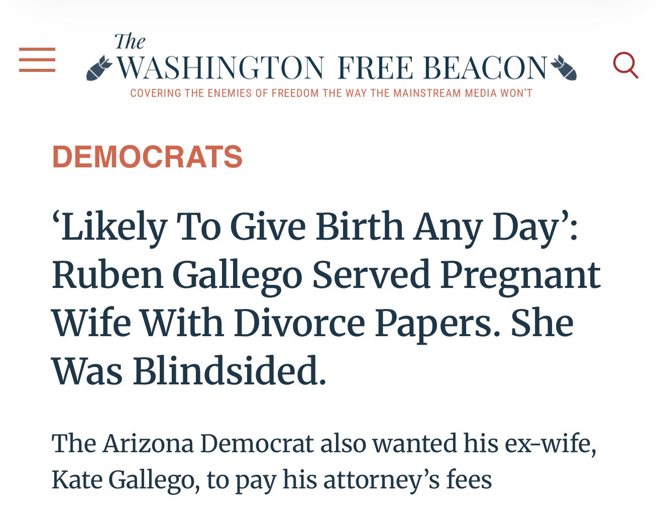
And obviously Reuben Gallego didn't let his "political life" get in the way of his extramarital dating life:
Gmac-WTF did you think was going to happen?: "Off to bed, I stayed long enough to see what was u ..."
m: "lookit that Biden's Dog boing w00t ..."
m: "Pixy's up! ..."
Biden's Dog sniffs a whole lotta malarkey, : "BOING! ..."
Skip: "I'll.put coffee on until Pixy shows up ..."
Braenyard - some Absent Friends are more equal than others _: "I don't think Trump will be outfoxed. The brewing ..."
Biden's Dog sniffs a whole lotta malarkey, : "Congrats, Trump. You've been trumped! [i]Intell ..."
buddhaha: "Saturday on the ONT on Flag Day/Trump's Bdy Eve. L ..."
Dark Lixtiquatal: ""Kaopectate" I wonder how that would be prono ..."
Braenyard - some Absent Friends are more equal than others _: "Jill and Hunter, I've read, had great dislike for ..."
Skip: "If Iwent to bed on time I would get up ..."
RI Red's Blog!
Behind The Black
CutJibNewsletter
The Pipeline
Second City Cop
Talk Of The Town with Steve Noxon
Belmont Club
Chicago Boyz
Cold Fury
Da Goddess
Daily Pundit
Dawn Eden
Day by Day (Cartoon)
EduWonk
Enter Stage Right
The Epoch Times
Grim's Hall
Victor Davis Hanson
Hugh Hewitt
IMAO
Instapundit
JihadWatch
Kausfiles
Lileks/The Bleat
Memeorandum (Metablog)
Outside the Beltway
Patterico's Pontifications
The People's Cube
Powerline
RedState
Reliapundit
Viking Pundit
WizBang
Thanksgivingmanship: How to Deal With Your Spoiled Stupid Leftist Adultbrat Relatives Who Have Spent Three Months Reading Slate and Vox Learning How to Deal With You
You're Fired! Donald Trump Grills the 2004 Democrat Candidates and Operatives on Their Election Loss
Bizarrely I had a perfect Donald Trump voice going in 2004 and then literally never used it again, even when he was running for president.
A Eulogy In Advance for Former Lincoln Project Associate and Noted Twitter Pestilence Tom Nichols
Special Guest Blogger Rich "Psycho" Giamboni: If You Touch My Sandwich One More Time, I Will Fvcking Kill You
Special Guest Blogger Rich "Psycho" Giamboni: I Must Eat Jim Acosta
Special Guest Blogger Tom Friedman: We Need to Talk About What My Egyptian Cab Driver Told Me About Globalization Shortly Before He Began to Murder Me
Special Guest Blogger Bernard Henri-Levy: I rise in defense of my very good friend Dominique Strauss-Kahn
Note: Later events actually proved Dominique Strauss-Kahn completely innocent. The piece is still funny though -- if you pretend, for five minutes, that he was guilty.
The Ace of Spades HQ Sex-for-Money Skankathon
A D&D Guide to the Democratic Candidates
Michael Moore Goes on Lunchtime Manhattan Death-Spree
Artificial Insouciance: Maureen Dowd's Word Processor Revolts Against Her Numbing Imbecility
The Dowd-O-Matic!
The Donkey ("The Raven" parody)
- June 2026
- May 2026
- April 2026
- March 2026
- February 2026
- January 2026
- December 2025
- November 2025
- October 2025
- September 2025
- August 2025
- July 2025
- June 2025
- May 2025
- April 2025
- March 2025
- February 2025
- January 2025
- December 2024
- November 2024
- October 2024
- September 2024
- August 2024
- July 2024
- June 2024
- May 2024
- April 2024
- March 2024
- February 2024
- January 2024
- December 2023
- November 2023
- October 2023
- September 2023
- August 2023
- July 2023
- June 2023
- May 2023
- April 2023
- March 2023
- February 2023
- January 2023
- December 2022
- November 2022
- October 2022
- September 2022
- August 2022
- July 2022
- June 2022
- May 2022
- April 2022
- March 2022
- February 2022
- January 2022
- December 2021
- November 2021
- October 2021
- September 2021
- August 2021
- July 2021
- June 2021
- May 2021
- April 2021
- March 2021
- February 2021
- January 2021
- December 2020
- November 2020
- October 2020
- September 2020
- August 2020
- July 2020
- June 2020
- May 2020
- April 2020
- March 2020
- February 2020
- January 2020
- December 2019
- November 2019
- October 2019
- September 2019
- August 2019
- July 2019
- June 2019
- May 2019
- April 2019
- March 2019
- February 2019
- January 2019
- December 2018
- November 2018
- October 2018
- September 2018
- August 2018
- July 2018
- June 2018
- May 2018
- April 2018
- March 2018
- February 2018
- January 2018
- December 2017
- November 2017
- October 2017
- September 2017
- August 2017
- July 2017
- June 2017
- May 2017
- April 2017
- March 2017
- February 2017
- January 2017
- December 2016
- November 2016
- October 2016
- September 2016
- August 2016
- July 2016
- June 2016
- May 2016
- April 2016
- March 2016
- February 2016
- January 2016
- December 2015
- November 2015
- October 2015
- September 2015
- August 2015
- July 2015
- June 2015
- May 2015
- April 2015
- March 2015
- February 2015
- January 2015
- December 2014
- November 2014
- October 2014
- September 2014
- August 2014
- July 2014
- June 2014
- May 2014
- April 2014
- March 2014
- February 2014
- January 2014
- December 2013
- November 2013
- October 2013
- September 2013
- August 2013
- July 2013
- June 2013
- May 2013
- April 2013
- March 2013
- February 2013
- January 2013
- December 2012
- November 2012
- October 2012
- September 2012
- August 2012
- July 2012
- June 2012
- May 2012
- April 2012
- March 2012
- February 2012
- January 2012
- December 2011
- November 2011
- October 2011
- September 2011
- August 2011
- July 2011
- June 2011
- May 2011
- April 2011
- March 2011
- February 2011
- January 2011
- December 2010
- November 2010
- October 2010
- September 2010
- August 2010
- July 2010
- June 2010
- May 2010
- April 2010
- March 2010
- February 2010
- January 2010
- December 2009
- November 2009
- October 2009
- September 2009
- August 2009
- July 2009
- June 2009
- May 2009
- April 2009
- March 2009
- February 2009
- January 2009
- December 2008
- November 2008
- October 2008
- September 2008
- August 2008
- July 2008
- June 2008
- May 2008
- April 2008
- March 2008
- February 2008
- January 2008
- December 2007
- November 2007
- October 2007
- September 2007
- August 2007
- July 2007
- June 2007
- May 2007
- April 2007
- March 2007
- February 2007
- January 2007
- December 2006
- November 2006
- October 2006
- September 2006
- August 2006
- July 2006
- June 2006
- May 2006
- April 2006
- March 2006
- February 2006
- January 2006
- December 2005
- November 2005
- October 2005
- September 2005
- August 2005
- July 2005
- June 2005
- May 2005
- April 2005
- March 2005
- February 2005
- January 2005
- December 2004
- November 2004
- October 2004
- September 2004
- August 2004
- July 2004
- June 2004
- May 2004
- April 2004
- December 0000