Intermarkets' Privacy Policy
Support
Donate to Ace of Spades HQ!
Contact
Ace:aceofspadeshq at gee mail.com
Buck:
buck.throckmorton at protonmail.com
CBD:
cbd at cutjibnewsletter.com
joe mannix:
mannix2024 at proton.me
MisHum:
petmorons at gee mail.com
J.J. Sefton:
sefton at cutjibnewsletter.com
Recent Entries
Democrat Whistleblower Claims that Adam Schiff Ordered His Staff to Illegally Leak Classified Information In Order to Rig and Indictment Against Trump
South Carolina's Legislature Will Delete C***s***er Jim Clyburn's Seat Tomorrow; Alabama Now Free to Eliminate One of Its Two Democrat Districts
The Morning Rant: AI-Driven Redistricting?
Mid-Morning Art Thread
The Morning Report — 5/ 12/26
Daily Tech News 12 May 2026
Monday Overnight Open Thread (5/11/26)
Someone's Got a Case of the Mondays Cafe
Quick Hits
Washington Post: 42% of Democrats Think the Butler PA Assassination Attempt that Killed One Man Was "Staged"
Absent Friends
Captain Whitebread 2026
Jon Ekdahl 2026
Jay Guevara 2025
Jim Sunk New Dawn 2025
Jewells45 2025
Bandersnatch 2024
GnuBreed 2024
Captain Hate 2023
moon_over_vermont 2023
westminsterdogshow 2023
Ann Wilson(Empire1) 2022
Dave In Texas 2022
Jesse in D.C. 2022
OregonMuse 2022
redc1c4 2021
Tami 2021
Chavez the Hugo 2020
Ibguy 2020
Rickl 2019
Joffen 2014
AoSHQ Writers Group
A site for members of the Horde to post their stories seeking beta readers, editing help, brainstorming, and story ideas. Also to share links to potential publishing outlets, writing help sites, and videos posting tips to get published.
Contact OrangeEnt for info:
maildrop62 at proton dot me
maildrop62 at proton dot me
Cutting The Cord And Email Security
Moron Meet-Ups
Texas MoMe 2026: 10/16/2026-10/17/2026 Corsicana,TX
Contact Ben Had for info
« Triumph |
Main
| The Order of Battle »

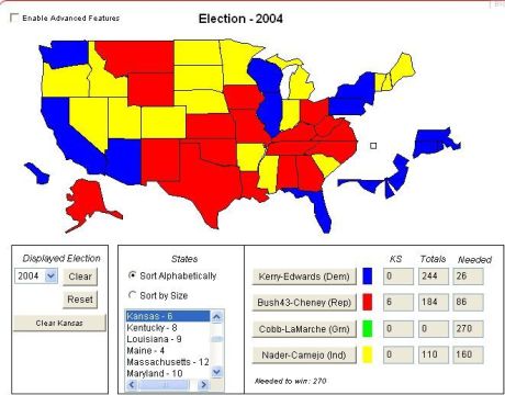
Click image to enlarge
June 28, 2007
Mapping the Immigration Vote/IMPORTANT UPDATE

IMPORTANT UPDATE: For any Wall Street Journal types who might be reading this site, producing the vivid colors in the above map cost over $7.5 million dollars in undisclosed funding, and required 36 hours of constant access to the latest generation of quantum supercomputers. I'm not sure where the money came from, but Michelle Malkin keeps the computers in her garage. FYI.
For everyone smarter than a WSJ contributor, the above map was created using an Electoral College Calculator found on the following site: http://www.grayraven.com/ec/.
I used it to reproduce the State by State results of today's Senate 46-53 cloture vote on the Immigration bill to see if any interesting trends might be revealed from reviewing the data in this format.
The Key is as follows:
Red States- Both Senators voted "No" on the cloture vote.
Yellow States- These delegation split, with one Senator voting on each side.
Blue States- Both Senators voted "Yes" on the cloture vote.
On first blush, this reveals some interesting things:
*A plurality of States, 18, saw their delegations vote "No". 17 states were "undecided" and only 15 states saw their delegations vote "Yes"
*Discounting "undecided" states, the map does not look all that dissimilar from the electoral college results of the 2000 and 2004 election, in that this vote reveals a similar dynamic with regard to voting behavior between the South/Midwest and the Coasts.
*Although Red "Opposed" States carried a plurality in terms of States carried, the Blue "Yes" States actually carried a plurality in the electoral college, although not enough to have reached 270.
*Some of the state by state results are counter-intuitive. The 4 southern border states split. Who is right? Cornyn and Hutchison or Kyl and McCain?
*The state of Florida sticks out as the only deep South state which went "Blue".
*Are voters in Maine, Vermont and New Hampshire really in sync with voters in Arkansas, Mississippi and South Carolina? According to the map, they could fairly be lumped together.
*Does the map tend to reveal certain Senators that are out of touch with the voters in their own state? Arkansas has two Democratic senators. It split. Mississippi has 2 Republican senators. It split. These senators can't all be reflecting their constituents on this issue.
*Look at all the Yellow states in the Agricultural West and Upper Midwest, that would have been "Red States" for purposes of the 2000 and 2004 Presidential election? Does this show the extent of Agribusinesses lobbying power?
These are just some perfunctory thoughts as I look at the map for the first time. Perhaps some of you see some other interesting trends emerging here. Feel free to drop your thoughts in the comments.
Note: Thanks to Slublog for helping me incorporate the image into the site in a form that was a lot nicer looking than the mess I uploaded. Thanks, Slu!
Recent Comments
rickb223 [/b][/s][/u][/i]:
"You know who isn't proportionately represented in ..."
Gmac-WTF did you think was going to happen?: "Hank Johnson's GA district is so tortured it's an ..."
whig: "273 Remember, Section 2 of the VRA states explicit ..."
Bulg: "Silent and Boomers clutching on to DELICIOUS POWER ..."
Northernlurker , Maple Syrup MAGA : "Is Clyburn one of those ancient civil rights worke ..."
TheJamesMadison, discovering British horror with Hammer Films: "286 Posted by: TheJamesMadison, discovering Britis ..."
rickb223 [/b][/s][/u][/i]: "New viral trend: snatching the nose rings off. I b ..."
Comrade Flounder, Disinformation Demon: "Silent and Boomers clutching on to DELICIOUS POWER ..."
...: "Posted by: TheJamesMadison, discovering British ho ..."
TheJamesMadison, discovering British horror with Hammer Films: "Kemp is nothing after this year. He's going to ..."
melodicmetal: "Whoever said Republicans hide like humans from sky ..."
connected and litigious: "New viral trend: snatching the nose rings off. I ..."
Recent Entries
Democrat Whistleblower Claims that Adam Schiff Ordered His Staff to Illegally Leak Classified Information In Order to Rig and Indictment Against Trump
South Carolina's Legislature Will Delete C***s***er Jim Clyburn's Seat Tomorrow; Alabama Now Free to Eliminate One of Its Two Democrat Districts
The Morning Rant: AI-Driven Redistricting?
Mid-Morning Art Thread
The Morning Report — 5/ 12/26
Daily Tech News 12 May 2026
Monday Overnight Open Thread (5/11/26)
Someone's Got a Case of the Mondays Cafe
Quick Hits
Washington Post: 42% of Democrats Think the Butler PA Assassination Attempt that Killed One Man Was "Staged"
South Carolina's Legislature Will Delete C***s***er Jim Clyburn's Seat Tomorrow; Alabama Now Free to Eliminate One of Its Two Democrat Districts
The Morning Rant: AI-Driven Redistricting?
Mid-Morning Art Thread
The Morning Report — 5/ 12/26
Daily Tech News 12 May 2026
Monday Overnight Open Thread (5/11/26)
Someone's Got a Case of the Mondays Cafe
Quick Hits
Washington Post: 42% of Democrats Think the Butler PA Assassination Attempt that Killed One Man Was "Staged"
Search
Polls! Polls! Polls!
Frequently Asked Questions
The (Almost) Complete Paul Anka Integrity Kick
Primary Document: The Audio
Paul Anka Haiku Contest Announcement
Integrity SAT's: Entrance Exam for Paul Anka's Band
AllahPundit's Paul Anka 45's Collection
AnkaPundit: Paul Anka Takes Over the Site for a Weekend (Continues through to Monday's postings)
George Bush Slices Don Rumsfeld Like an F*ckin' Hammer
Paul Anka Haiku Contest Announcement
Integrity SAT's: Entrance Exam for Paul Anka's Band
AllahPundit's Paul Anka 45's Collection
AnkaPundit: Paul Anka Takes Over the Site for a Weekend (Continues through to Monday's postings)
George Bush Slices Don Rumsfeld Like an F*ckin' Hammer
Top Top Tens
Democratic Forays into Erotica
New Shows On Gore's DNC/MTV Network
Nicknames for Potatoes, By People Who Really Hate Potatoes
Star Wars Euphemisms for Self-Abuse
Signs You're at an Iraqi "Wedding Party"
Signs Your Clown Has Gone Bad
Signs That You, Geroge Michael, Should Probably Just Give It Up
Signs of Hip-Hop Influence on John Kerry
NYT Headlines Spinning Bush's Jobs Boom
Things People Are More Likely to Say Than "Did You Hear What Al Franken Said Yesterday?"
Signs that Paul Krugman Has Lost His Frickin' Mind
All-Time Best NBA Players, According to Senator Robert Byrd
Other Bad Things About the Jews, According to the Koran
Signs That David Letterman Just Doesn't Care Anymore
Examples of Bob Kerrey's Insufferable Racial Jackassery
Signs Andy Rooney Is Going Senile
Other Judgments Dick Clarke Made About Condi Rice Based on Her Appearance
Collective Names for Groups of People
John Kerry's Other Vietnam Super-Pets
Cool Things About the XM8 Assault Rifle
Media-Approved Facts About the Democrat Spy
Changes to Make Christianity More "Inclusive"
Secret John Kerry Senatorial Accomplishments
John Edwards Campaign Excuses
John Kerry Pick-Up Lines
Changes Liberal Senator George Michell Will Make at Disney
Torments in Dog-Hell
Greatest Hitjobs
The Ace of Spades HQ Sex-for-Money Skankathon
A D&D Guide to the Democratic Candidates
Margaret Cho: Just Not Funny
More Margaret Cho Abuse
Margaret Cho: Still Not Funny
Iraqi Prisoner Claims He Was Raped... By Woman
Wonkette Announces "Morning Zoo" Format
John Kerry's "Plan" Causes Surrender of Moqtada al-Sadr's Militia
World Muslim Leaders Apologize for Nick Berg's Beheading
Michael Moore Goes on Lunchtime Manhattan Death-Spree
Milestone: Oliver Willis Posts 400th "Fake News Article" Referencing Britney Spears
Liberal Economists Rue a "New Decade of Greed"
Artificial Insouciance: Maureen Dowd's Word Processor Revolts Against Her Numbing Imbecility
Intelligence Officials Eye Blogs for Tips
They Done Found Us Out, Cletus: Intrepid Internet Detective Figures Out Our Master Plan
Shock: Josh Marshall Almost Mentions Sarin Discovery in Iraq
Leather-Clad Biker Freaks Terrorize Australian Town
When Clinton Was President, Torture Was Cool
What Wonkette Means When She Explains What Tina Brown Means
Wonkette's Stand-Up Act
Wankette HQ Gay-Rumors Du Jour
Here's What's Bugging Me: Goose and Slider
My Own Micah Wright Style Confession of Dishonesty
Outraged "Conservatives" React to the FMA
An On-Line Impression of Dennis Miller Having Sex with a Kodiak Bear
The Story the Rightwing Media Refuses to Report!
Our Lunch with David "Glengarry Glen Ross" Mamet
The House of Love: Paul Krugman
A Michael Moore Mystery (TM)
The Dowd-O-Matic!
Liberal Consistency and Other Myths
Kepler's Laws of Liberal Media Bias
John Kerry-- The Splunge! Candidate
"Divisive" Politics & "Attacks on Patriotism" (very long)
The Donkey ("The Raven" parody)

