Intermarkets' Privacy Policy
Donate to Ace of Spades HQ!
aceofspadeshq at gee mail.com
Buck:
buck.throckmorton at protonmail.com
CBD:
cbd at cutjibnewsletter.com
joe mannix:
mannix2024 at proton.me
MisHum:
petmorons at gee mail.com
J.J. Sefton:
sefton at cutjibnewsletter.com
Daily Tech News 3 May 2026
Saturday Night Club ONT - May 2, 2026 [D Squared]
Saturday Evening Movie Post [moviegique]: Over Your Dead Body
Hobby Thread - May 2, 2026 [TRex]
Ace of Spades Pet Thread, May 2
Gardening, Home and Nature Thread, May 2
Turning long stories into short stories
The Classical Saturday Morning Coffee Break & Prayer Revival
Daily Tech News 2 May 2026
Jay Guevara 2025
Jim Sunk New Dawn 2025
Jewells45 2025
Bandersnatch 2024
GnuBreed 2024
Captain Hate 2023
moon_over_vermont 2023
westminsterdogshow 2023
Ann Wilson(Empire1) 2022
Dave In Texas 2022
Jesse in D.C. 2022
OregonMuse 2022
redc1c4 2021
Tami 2021
Chavez the Hugo 2020
Ibguy 2020
Rickl 2019
Joffen 2014
maildrop62 at proton dot me
Texas MoMe 2026: 10/16/2026-10/17/2026 Corsicana,TX
Contact Ben Had for info
New Logo
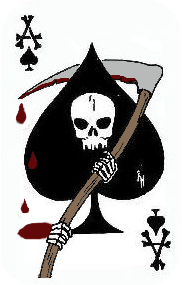
Well, it served me well, but the old death-card:

had to be retired, for a couple of reasons. First, I thought the skull was too small and, well, a little goofy-looking. Second, I sort of want to sell t-shirts, and I couldn't track down whether that image was still copyrighted; I decided to err on the side of caution and get a new design. Third, it was a little too smallish in its details to look good on a t-shirt anyway. Those skeletal hands... always figured out they'd wind up looking like Snoopy's paws.
Riehl World View did the original death card for me, basing it off an old Vietnam-era death-card. Great design, of course, and I miss that connection with real military history... but there are lawsuits to consider. Plus, I wanted a more classically piratical design, to go along with the killer Mencken quote.
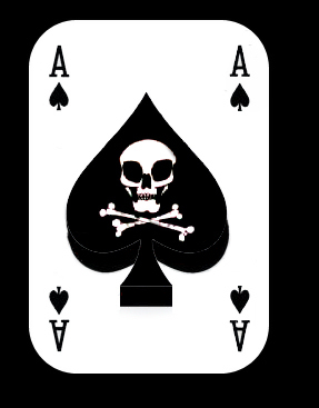
I asked George from Snapshot to design me a skull-and-crossed swords design, swords behind the skull to fit on the ace. I also asked him, "Make the eyes both look vaguely menacing and vaguely jovial." That's a pretty hard thing to accomplish, but George nailed it on the first try.
Cool swords, too. You have no idea the f'n' exasperation I put him through over those swords. I swear, I had him try out every possible blade and hilt combination from a Scottish Claymore to a +3 Flame Tongue.
George was busy with business or family this past week -- or perhaps he went crazy from my annoying and constant suggestions for minor changes in the design -- and I asked Riehl World View to come in and pitch relief and finish the design up-- shrinking down one larger-than-the-other hilt, adding some blood to the blade, making the double-curved Arab-esque blade look a little more realistic, superimposing it on an ace, and adding it to a new banner with a crisper look. He knocked the whole thing together, beautifully I think, in two days.
And boy, you have no idea the problems I gave Riehl World over the blood.
Now, there's some loose shit going on with the page-borders and stuff-- yeah, I know, the BlogAds creep up into the banner, and I've got to fix the background color to match the slightly different gray Riehl World used -- but I've contacted Web Diva to try to get that all up to snuff, so the site should be looking like it has integrity again pretty soon. And cooler, I think.
Thanks so much to Snapshot and Riehl World View for putting up with my annoying demands. I'm a real taskmaster-- or, should I say, quartermaster, arrrgghh -- and they put up with more of my bullshit than any human should be expected to. As Riehl World told me tonight, "It's a good thing you ain't married yet, or you'd be dead already."
The new card isn't a perfect duplicate of a Vietnam-era death-card, of course, but it's similar in the basics to ones used by the military. This, for example, is one I found on-line, used by troops in Iraq:

Cool, yeah, but... I like George's skull a lot better. And to hell with crossed bones. You can't slit a throat with a bone. At least not without a lot of wasted effort.
Anyway, that's the new logo. I love it. I hope you guys like it too.
Aaarrhhh.
Loose Shit That Will Be Straightened Out: For now, the logo is a work in progress. I'm going to lose the blood -- too garish, plus it obscures the cool shape of that sword -- and I'll move those little "A's" in the corner so that they don't conflict with the logo, or ditch them entirely.
And yes-- the BlogAds overlap with the logo, and the background/border is now the wrong shade of gray.
Web-Diva has been alerted!
Aetius451AD: "162 If it's on YouTube it's got to be true. Poste ..."
Three Pittle Igs: "Three Stooges>>Three Gorges ..."
runner: "Maybe the UK should send its troops to Germany. ..."
runner: "It's not just the BBC, it's the Daily Mail, probab ..."
Said no one ever : "If it's on YouTube it's got to be true. ..."
m: "from the BBC article: Clay Higgins, a Republica ..."
NaCly Dog: "Tom Servo Ubi solitudinem faciunt, pacem appel ..."
Aetius451AD: "Corrupt and low standards that are not achieved is ..."
Dark L: "3GD is not anchored to the bedrock? I can't wait ..."
m: "from the BBC article, these two Rs are: Roger W ..."
runner: "The worst signal to Russia is to show that there a ..."
Daily Tech News 3 May 2026
Saturday Night Club ONT - May 2, 2026 [D Squared]
Saturday Evening Movie Post [moviegique]: Over Your Dead Body
Hobby Thread - May 2, 2026 [TRex]
Ace of Spades Pet Thread, May 2
Gardening, Home and Nature Thread, May 2
Turning long stories into short stories
The Classical Saturday Morning Coffee Break & Prayer Revival
Daily Tech News 2 May 2026
Paul Anka Haiku Contest Announcement
Integrity SAT's: Entrance Exam for Paul Anka's Band
AllahPundit's Paul Anka 45's Collection
AnkaPundit: Paul Anka Takes Over the Site for a Weekend (Continues through to Monday's postings)
George Bush Slices Don Rumsfeld Like an F*ckin' Hammer
Democratic Forays into Erotica
New Shows On Gore's DNC/MTV Network
Nicknames for Potatoes, By People Who Really Hate Potatoes
Star Wars Euphemisms for Self-Abuse
Signs You're at an Iraqi "Wedding Party"
Signs Your Clown Has Gone Bad
Signs That You, Geroge Michael, Should Probably Just Give It Up
Signs of Hip-Hop Influence on John Kerry
NYT Headlines Spinning Bush's Jobs Boom
Things People Are More Likely to Say Than "Did You Hear What Al Franken Said Yesterday?"
Signs that Paul Krugman Has Lost His Frickin' Mind
All-Time Best NBA Players, According to Senator Robert Byrd
Other Bad Things About the Jews, According to the Koran
Signs That David Letterman Just Doesn't Care Anymore
Examples of Bob Kerrey's Insufferable Racial Jackassery
Signs Andy Rooney Is Going Senile
Other Judgments Dick Clarke Made About Condi Rice Based on Her Appearance
Collective Names for Groups of People
John Kerry's Other Vietnam Super-Pets
Cool Things About the XM8 Assault Rifle
Media-Approved Facts About the Democrat Spy
Changes to Make Christianity More "Inclusive"
Secret John Kerry Senatorial Accomplishments
John Edwards Campaign Excuses
John Kerry Pick-Up Lines
Changes Liberal Senator George Michell Will Make at Disney
Torments in Dog-Hell
The Ace of Spades HQ Sex-for-Money Skankathon
A D&D Guide to the Democratic Candidates
Margaret Cho: Just Not Funny
More Margaret Cho Abuse
Margaret Cho: Still Not Funny
Iraqi Prisoner Claims He Was Raped... By Woman
Wonkette Announces "Morning Zoo" Format
John Kerry's "Plan" Causes Surrender of Moqtada al-Sadr's Militia
World Muslim Leaders Apologize for Nick Berg's Beheading
Michael Moore Goes on Lunchtime Manhattan Death-Spree
Milestone: Oliver Willis Posts 400th "Fake News Article" Referencing Britney Spears
Liberal Economists Rue a "New Decade of Greed"
Artificial Insouciance: Maureen Dowd's Word Processor Revolts Against Her Numbing Imbecility
Intelligence Officials Eye Blogs for Tips
They Done Found Us Out, Cletus: Intrepid Internet Detective Figures Out Our Master Plan
Shock: Josh Marshall Almost Mentions Sarin Discovery in Iraq
Leather-Clad Biker Freaks Terrorize Australian Town
When Clinton Was President, Torture Was Cool
What Wonkette Means When She Explains What Tina Brown Means
Wonkette's Stand-Up Act
Wankette HQ Gay-Rumors Du Jour
Here's What's Bugging Me: Goose and Slider
My Own Micah Wright Style Confession of Dishonesty
Outraged "Conservatives" React to the FMA
An On-Line Impression of Dennis Miller Having Sex with a Kodiak Bear
The Story the Rightwing Media Refuses to Report!
Our Lunch with David "Glengarry Glen Ross" Mamet
The House of Love: Paul Krugman
A Michael Moore Mystery (TM)
The Dowd-O-Matic!
Liberal Consistency and Other Myths
Kepler's Laws of Liberal Media Bias
John Kerry-- The Splunge! Candidate
"Divisive" Politics & "Attacks on Patriotism" (very long)
The Donkey ("The Raven" parody)

