Intermarkets' Privacy Policy
Support
Donate to Ace of Spades HQ!
Contact
Ace:aceofspadeshq at gee mail.com
Buck:
buck.throckmorton at protonmail.com
CBD:
cbd at cutjibnewsletter.com
joe mannix:
mannix2024 at proton.me
MisHum:
petmorons at gee mail.com
J.J. Sefton:
sefton at cutjibnewsletter.com
Recent Entries
Food Thread: Ice Cream! It's What's For Breakfast!
First World Problems...
The GOPe Is Alive And Well And Stealing Our Money
Sunday Morning Book Thread - 5-3-2026 ["Perfessor" Squirrel]
Daily Tech News 3 May 2026
Saturday Night Club ONT - May 2, 2026 [D Squared]
Saturday Evening Movie Post [moviegique]: Over Your Dead Body
Hobby Thread - May 2, 2026 [TRex]
Ace of Spades Pet Thread, May 2
Gardening, Home and Nature Thread, May 2
Absent Friends
Jon Ekdahl 2026
Jay Guevara 2025
Jim Sunk New Dawn 2025
Jewells45 2025
Bandersnatch 2024
GnuBreed 2024
Captain Hate 2023
moon_over_vermont 2023
westminsterdogshow 2023
Ann Wilson(Empire1) 2022
Dave In Texas 2022
Jesse in D.C. 2022
OregonMuse 2022
redc1c4 2021
Tami 2021
Chavez the Hugo 2020
Ibguy 2020
Rickl 2019
Joffen 2014
AoSHQ Writers Group
A site for members of the Horde to post their stories seeking beta readers, editing help, brainstorming, and story ideas. Also to share links to potential publishing outlets, writing help sites, and videos posting tips to get published.
Contact OrangeEnt for info:
maildrop62 at proton dot me
maildrop62 at proton dot me
Cutting The Cord And Email Security
Moron Meet-Ups
Texas MoMe 2026: 10/16/2026-10/17/2026 Corsicana,TX
Contact Ben Had for info
« Debate: Mike Flynn Vs. Obama's Former Transportation Secretary's Son |
Main
| Overnight Open Thread (6-24-2015) »

June 24, 2015
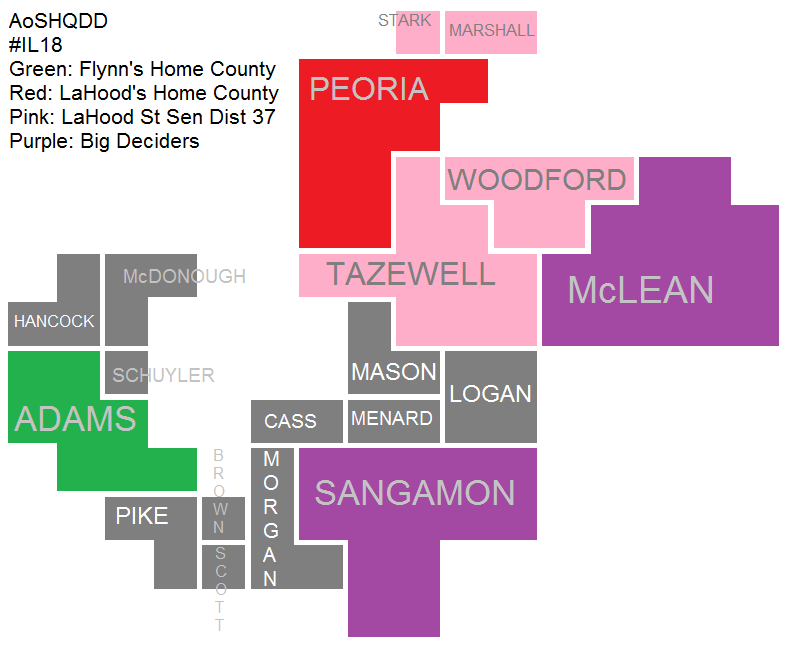
What #IL18 actually looks like (for the primary)
Where Mike Flynn and Darin LaHood should do their best, and where the game will be fought.
I took some time to warp this Romney+25 Congressional District for the Decision Desk, which will be providing live returns on 7/7. LaHood, as already discussed, is a State Senator hailing from Peoria County, and his district overlaps this in the areas shaded in light red:

Counties have been re-sized to show the number of expected Republican voters. One thing I've advocated, like in my treachery at The Federalist and National Review, is the importance of registering new voters and turning them out. The Party does a pretty poor job of it, so this could be an opportunity for conservative insurgents: they can sign up, log, and turn out these disillusioned voters especially in off-year specials like what we have coming up.
I don't know if Flynn's team has invested at all in this, but if they are utilizing a mobilization system similar to Brat's in 2014, he has an excellent chance of maximizing votes out of his home county, McLean, and Sangamon, where the bulk of the "not-in-LaHood's district" voters live. If he can get clear majorities in all three counties, he's in like...well you know.
Anyways, just thought I'd stop by.
A more thorough explainer on how this diagram was created:
I took the primary numbers from 2012 and 2014 on the Republican side, averaged each county's totals, then assigned 1 block for every 1% a county made up of the CD-wide vote. If a county was really really small, it still got a single block, so there was some rounding to include all participating counties. There are a total of 100 blocks in the diagram.
Recent Comments
Skip:
"FOODIE NOODIE TIME ..."
Pug Mahon, Rock 'n' Roll Martian: "@126/Pug Mahon: "... and she was not one of the wi ..."
Grumpy and Recalcitrant[/b][/i][/s][/u]: ". NOOD FOOD [b]NOOD![/b] ..."
Skip: "Food fight ..."
Grumpy and Recalcitrant[/b][/i][/s][/u]: "I'll summon the others. ..."
buzzion: "[i]Lightening connectors fall out of my phone. ..."
Braenyard - some Absent Friends are more equal than others _: "Also, locking connections are better than friction ..."
Pineapple, Napalm and Barbed Wire Consortium of Hawaii: "So many different sizes of buttplugs, too! Posted ..."
Skip: "Co-worker uses some king of wireless charge for hi ..."
AoS Style Guide: ">>> 18 I will say, LTT started selling decent cabl ..."
Grumpy and Recalcitrant[/b][/i][/s][/u]: "@126/Pug Mahon: "[i]... and she was not one of th ..."
Martini Farmer: "Of course there's the Silverado HD with a 30' trai ..."
Recent Entries
Food Thread: Ice Cream! It's What's For Breakfast!
First World Problems...
The GOPe Is Alive And Well And Stealing Our Money
Sunday Morning Book Thread - 5-3-2026 ["Perfessor" Squirrel]
Daily Tech News 3 May 2026
Saturday Night Club ONT - May 2, 2026 [D Squared]
Saturday Evening Movie Post [moviegique]: Over Your Dead Body
Hobby Thread - May 2, 2026 [TRex]
Ace of Spades Pet Thread, May 2
Gardening, Home and Nature Thread, May 2
First World Problems...
The GOPe Is Alive And Well And Stealing Our Money
Sunday Morning Book Thread - 5-3-2026 ["Perfessor" Squirrel]
Daily Tech News 3 May 2026
Saturday Night Club ONT - May 2, 2026 [D Squared]
Saturday Evening Movie Post [moviegique]: Over Your Dead Body
Hobby Thread - May 2, 2026 [TRex]
Ace of Spades Pet Thread, May 2
Gardening, Home and Nature Thread, May 2
Search
Polls! Polls! Polls!
Frequently Asked Questions
The (Almost) Complete Paul Anka Integrity Kick
Primary Document: The Audio
Paul Anka Haiku Contest Announcement
Integrity SAT's: Entrance Exam for Paul Anka's Band
AllahPundit's Paul Anka 45's Collection
AnkaPundit: Paul Anka Takes Over the Site for a Weekend (Continues through to Monday's postings)
George Bush Slices Don Rumsfeld Like an F*ckin' Hammer
Paul Anka Haiku Contest Announcement
Integrity SAT's: Entrance Exam for Paul Anka's Band
AllahPundit's Paul Anka 45's Collection
AnkaPundit: Paul Anka Takes Over the Site for a Weekend (Continues through to Monday's postings)
George Bush Slices Don Rumsfeld Like an F*ckin' Hammer
Top Top Tens
Democratic Forays into Erotica
New Shows On Gore's DNC/MTV Network
Nicknames for Potatoes, By People Who Really Hate Potatoes
Star Wars Euphemisms for Self-Abuse
Signs You're at an Iraqi "Wedding Party"
Signs Your Clown Has Gone Bad
Signs That You, Geroge Michael, Should Probably Just Give It Up
Signs of Hip-Hop Influence on John Kerry
NYT Headlines Spinning Bush's Jobs Boom
Things People Are More Likely to Say Than "Did You Hear What Al Franken Said Yesterday?"
Signs that Paul Krugman Has Lost His Frickin' Mind
All-Time Best NBA Players, According to Senator Robert Byrd
Other Bad Things About the Jews, According to the Koran
Signs That David Letterman Just Doesn't Care Anymore
Examples of Bob Kerrey's Insufferable Racial Jackassery
Signs Andy Rooney Is Going Senile
Other Judgments Dick Clarke Made About Condi Rice Based on Her Appearance
Collective Names for Groups of People
John Kerry's Other Vietnam Super-Pets
Cool Things About the XM8 Assault Rifle
Media-Approved Facts About the Democrat Spy
Changes to Make Christianity More "Inclusive"
Secret John Kerry Senatorial Accomplishments
John Edwards Campaign Excuses
John Kerry Pick-Up Lines
Changes Liberal Senator George Michell Will Make at Disney
Torments in Dog-Hell
Greatest Hitjobs
The Ace of Spades HQ Sex-for-Money Skankathon
A D&D Guide to the Democratic Candidates
Margaret Cho: Just Not Funny
More Margaret Cho Abuse
Margaret Cho: Still Not Funny
Iraqi Prisoner Claims He Was Raped... By Woman
Wonkette Announces "Morning Zoo" Format
John Kerry's "Plan" Causes Surrender of Moqtada al-Sadr's Militia
World Muslim Leaders Apologize for Nick Berg's Beheading
Michael Moore Goes on Lunchtime Manhattan Death-Spree
Milestone: Oliver Willis Posts 400th "Fake News Article" Referencing Britney Spears
Liberal Economists Rue a "New Decade of Greed"
Artificial Insouciance: Maureen Dowd's Word Processor Revolts Against Her Numbing Imbecility
Intelligence Officials Eye Blogs for Tips
They Done Found Us Out, Cletus: Intrepid Internet Detective Figures Out Our Master Plan
Shock: Josh Marshall Almost Mentions Sarin Discovery in Iraq
Leather-Clad Biker Freaks Terrorize Australian Town
When Clinton Was President, Torture Was Cool
What Wonkette Means When She Explains What Tina Brown Means
Wonkette's Stand-Up Act
Wankette HQ Gay-Rumors Du Jour
Here's What's Bugging Me: Goose and Slider
My Own Micah Wright Style Confession of Dishonesty
Outraged "Conservatives" React to the FMA
An On-Line Impression of Dennis Miller Having Sex with a Kodiak Bear
The Story the Rightwing Media Refuses to Report!
Our Lunch with David "Glengarry Glen Ross" Mamet
The House of Love: Paul Krugman
A Michael Moore Mystery (TM)
The Dowd-O-Matic!
Liberal Consistency and Other Myths
Kepler's Laws of Liberal Media Bias
John Kerry-- The Splunge! Candidate
"Divisive" Politics & "Attacks on Patriotism" (very long)
The Donkey ("The Raven" parody)

