Intermarkets' Privacy Policy
Donate to Ace of Spades HQ!
aceofspadeshq at gee mail.com
Buck:
buck.throckmorton at protonmail.com
CBD:
cbd at cutjibnewsletter.com
joe mannix:
mannix2024 at proton.me
MisHum:
petmorons at gee mail.com
J.J. Sefton:
sefton at cutjibnewsletter.com
The Morning Rant: NATO...An Idea Whose Time Is Past
Mid-Morning Art Thread
The Morning Report — 4/ 28/26
Daily Tech News 28 April 2026
Monday Overnight Open Thread (4/27/26)
Baby's First Cafe
Quick Hits
Iran: How About We Postpone All Talks About Our Nuke Program While You End the Embargo, Like Obama Did?
When the Bullets Stopped Flying, Alcoholic "Journalist" Karens Focused On What Really Matters, and Looted 147 Wine Bottles from the Venue
Jay Guevara 2025
Jim Sunk New Dawn 2025
Jewells45 2025
Bandersnatch 2024
GnuBreed 2024
Captain Hate 2023
moon_over_vermont 2023
westminsterdogshow 2023
Ann Wilson(Empire1) 2022
Dave In Texas 2022
Jesse in D.C. 2022
OregonMuse 2022
redc1c4 2021
Tami 2021
Chavez the Hugo 2020
Ibguy 2020
Rickl 2019
Joffen 2014
maildrop62 at proton dot me
Texas MoMe 2026: 10/16/2026-10/17/2026 Corsicana,TX
Contact Ben Had for info
Post-Election State-by-State Trend Analysis (With Maps!)
One of the problems with pre-election war-gaming is that some simulations assume roughly uniform movement in all states based on previous elections and national polling. As you can see in the map below, this is clearly not the case. There are often regional trends, bounces for a candidate's home state, etc.
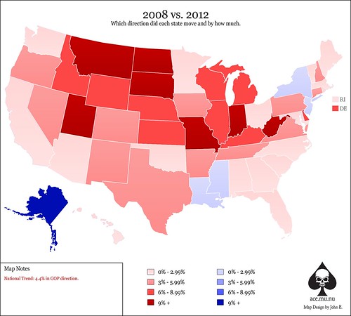
The first map below shows each state and the direction and intensity that the state moved from the 2008 election to the 2012 election.

As you can see, only five states moved in Obama's direction and there are explanations for each.
New Jersey and New York: This is probably the result of a Sandy bounce.
Louisiana and Mississippi: Unless there is a broader trend I'm missing, this is most likely not so much movement in 2012 but instead urban voters still displaced from Hurricane Katrina in 2008 that had finally returned home by this election. That could be wrong, but that's my guess.
Alaska: Sarah Palin bounce in 2008. Interestingly, Arizona did not see a similar crash in 2012.
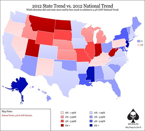
The next map compares each state's 2012 change to the national trend of 4.4% movement towards the GOP. This will show whether a state underperformed or outperformed the popular vote movement.

As you might expect, the Northeast didn't show much movement towards the GOP. What's interesting is just how badly the Southeast underperformed the national trend in 2012. The knee-jerk takeaway is probably that Evangelicals were a bit underwhelmed by Mitt Romney.
The Southwest has been rumored to be the future graveyard of the GOP, but both New Mexico and Nevada outperformed the national trend. Arizona's lack of movement is probably more the result of a slight 2008 bounce for McCain than anything else. So, perhaps that conclusion is a little premature.
Those all-important swing states of Virginia, Florida, Ohio, Iowa and Colorado? All of them underperformed the national trend. I'm sure Obama's ad blitz, early voting push and microtargeting focus on these states had plenty to do with that.
Some good news: the Rust Belt (minus Ohio) seems to be moving in the GOP's direction as a region. Unfortunately, it wasn't quite fast enough for the 2012 election but Republicans would be smart to target this region more forcefully in upcoming elections.
Finally, the gut punch: See the five reddest states on that map? This indicates the strongest movement towards the GOP in 2012 and all five states went to Mitt Romney decisively. There were also Senate races in those five states. We lost four of them.
Update: It seems I didn't explain this well enough. First map shows movement in 2012 relative to 2008. So, for example:
South Carolina: 2008 - GOP by 8.9%, 2012 - GOP by 10.6%. So the trend is only 1.7% towards the GOP, hence light red.
Second map compares this 1.7% movement to the national popular trend of 4.4% towards the GOP. Hence, South Carolina underperformed the national trend. So, blue.
The Democratic Party!: "RACISM!!! RACISM!!! RACISM!!! ALSO, DEATH TO TR ..."
vmom deport deport deport: "I love this ..."
Auspex: " Wasn't there a foreign adoption scandal involvin ..."
Archimedes: "[i]Japan is a very different country today, and I ..."
Guy Mohawk: "I agree with VDH, we should just become Canada 2 o ..."
XTC: "209 He refused to buy ANYTHING from Japan and hate ..."
vmom deport deport deport: "REEEE ..."
thatcrazyjerseyguy: "I think a revisit to this lady's rant about the Eu ..."
JackStraw: ">>He would have to be impeached, and neither side ..."
rickb223 [/b][/s][/u][/i]: "Jeez, what do I have to do to get fired around her ..."
Formerly Virginian[/i] [/b]: "I get it. The WWII vets who served in the Pacific ..."
The Morning Rant: NATO...An Idea Whose Time Is Past
Mid-Morning Art Thread
The Morning Report — 4/ 28/26
Daily Tech News 28 April 2026
Monday Overnight Open Thread (4/27/26)
Baby's First Cafe
Quick Hits
Iran: How About We Postpone All Talks About Our Nuke Program While You End the Embargo, Like Obama Did?
When the Bullets Stopped Flying, Alcoholic "Journalist" Karens Focused On What Really Matters, and Looted 147 Wine Bottles from the Venue
Paul Anka Haiku Contest Announcement
Integrity SAT's: Entrance Exam for Paul Anka's Band
AllahPundit's Paul Anka 45's Collection
AnkaPundit: Paul Anka Takes Over the Site for a Weekend (Continues through to Monday's postings)
George Bush Slices Don Rumsfeld Like an F*ckin' Hammer
Democratic Forays into Erotica
New Shows On Gore's DNC/MTV Network
Nicknames for Potatoes, By People Who Really Hate Potatoes
Star Wars Euphemisms for Self-Abuse
Signs You're at an Iraqi "Wedding Party"
Signs Your Clown Has Gone Bad
Signs That You, Geroge Michael, Should Probably Just Give It Up
Signs of Hip-Hop Influence on John Kerry
NYT Headlines Spinning Bush's Jobs Boom
Things People Are More Likely to Say Than "Did You Hear What Al Franken Said Yesterday?"
Signs that Paul Krugman Has Lost His Frickin' Mind
All-Time Best NBA Players, According to Senator Robert Byrd
Other Bad Things About the Jews, According to the Koran
Signs That David Letterman Just Doesn't Care Anymore
Examples of Bob Kerrey's Insufferable Racial Jackassery
Signs Andy Rooney Is Going Senile
Other Judgments Dick Clarke Made About Condi Rice Based on Her Appearance
Collective Names for Groups of People
John Kerry's Other Vietnam Super-Pets
Cool Things About the XM8 Assault Rifle
Media-Approved Facts About the Democrat Spy
Changes to Make Christianity More "Inclusive"
Secret John Kerry Senatorial Accomplishments
John Edwards Campaign Excuses
John Kerry Pick-Up Lines
Changes Liberal Senator George Michell Will Make at Disney
Torments in Dog-Hell
The Ace of Spades HQ Sex-for-Money Skankathon
A D&D Guide to the Democratic Candidates
Margaret Cho: Just Not Funny
More Margaret Cho Abuse
Margaret Cho: Still Not Funny
Iraqi Prisoner Claims He Was Raped... By Woman
Wonkette Announces "Morning Zoo" Format
John Kerry's "Plan" Causes Surrender of Moqtada al-Sadr's Militia
World Muslim Leaders Apologize for Nick Berg's Beheading
Michael Moore Goes on Lunchtime Manhattan Death-Spree
Milestone: Oliver Willis Posts 400th "Fake News Article" Referencing Britney Spears
Liberal Economists Rue a "New Decade of Greed"
Artificial Insouciance: Maureen Dowd's Word Processor Revolts Against Her Numbing Imbecility
Intelligence Officials Eye Blogs for Tips
They Done Found Us Out, Cletus: Intrepid Internet Detective Figures Out Our Master Plan
Shock: Josh Marshall Almost Mentions Sarin Discovery in Iraq
Leather-Clad Biker Freaks Terrorize Australian Town
When Clinton Was President, Torture Was Cool
What Wonkette Means When She Explains What Tina Brown Means
Wonkette's Stand-Up Act
Wankette HQ Gay-Rumors Du Jour
Here's What's Bugging Me: Goose and Slider
My Own Micah Wright Style Confession of Dishonesty
Outraged "Conservatives" React to the FMA
An On-Line Impression of Dennis Miller Having Sex with a Kodiak Bear
The Story the Rightwing Media Refuses to Report!
Our Lunch with David "Glengarry Glen Ross" Mamet
The House of Love: Paul Krugman
A Michael Moore Mystery (TM)
The Dowd-O-Matic!
Liberal Consistency and Other Myths
Kepler's Laws of Liberal Media Bias
John Kerry-- The Splunge! Candidate
"Divisive" Politics & "Attacks on Patriotism" (very long)
The Donkey ("The Raven" parody)

