Intermarkets' Privacy Policy
Support
Donate to Ace of Spades HQ!
Contact
Ace:aceofspadeshq at gee mail.com
Buck:
buck.throckmorton at protonmail.com
CBD:
cbd at cutjibnewsletter.com
joe mannix:
mannix2024 at proton.me
MisHum:
petmorons at gee mail.com
J.J. Sefton:
sefton at cutjibnewsletter.com
Recent Entries
Daily Tech News 12 May 2026
Monday Overnight Open Thread (5/11/26)
Someone's Got a Case of the Mondays Cafe
Quick Hits
Washington Post: 42% of Democrats Think the Butler PA Assassination Attempt that Killed One Man Was "Staged"
Unfunny Anti-Childbirth Hag Chelsea Handler Gets Destroyed at Netflix Roast of Kevin Hart
Keir Starmer Vows to Remain in Office for Ten Years, Double Downs on Endless Illegal Immigration, Calls Immigration Reformers "Dangerous" and Warns They Are Taking the UK Down a "Dark Path"
Virginia Democrats Seethe and Scheme to Mass-Fire All Seven Supreme Court Justices to Replace Them With Compliant Communist Operatives, but Senate Leader Says It's No-Go
Be Back Soon
MORNING RANT - The War on Labor Expense: There Never Was a Truck Driver Shortage
Absent Friends
Captain Whitebread 2026
Jon Ekdahl 2026
Jay Guevara 2025
Jim Sunk New Dawn 2025
Jewells45 2025
Bandersnatch 2024
GnuBreed 2024
Captain Hate 2023
moon_over_vermont 2023
westminsterdogshow 2023
Ann Wilson(Empire1) 2022
Dave In Texas 2022
Jesse in D.C. 2022
OregonMuse 2022
redc1c4 2021
Tami 2021
Chavez the Hugo 2020
Ibguy 2020
Rickl 2019
Joffen 2014
AoSHQ Writers Group
A site for members of the Horde to post their stories seeking beta readers, editing help, brainstorming, and story ideas. Also to share links to potential publishing outlets, writing help sites, and videos posting tips to get published.
Contact OrangeEnt for info:
maildrop62 at proton dot me
maildrop62 at proton dot me
Cutting The Cord And Email Security
Moron Meet-Ups
Texas MoMe 2026: 10/16/2026-10/17/2026 Corsicana,TX
Contact Ben Had for info
« Financial Briefing: No One Knows You When You're Down and Out |
Main
| Nobel Peace Prize Awarded To Chinese Dissident »
You can see that while they're at different levels, they pretty much follow the same trends, except for the little rise recently in the BLS household data. There's a similar, but smaller rise in the establishment data, and no rise at all in the ADP stats. This is borne out by this chart that I lifted from ADP's September report:
The BLS and ADP month-to-month changes agree pretty well until this past year, when the BLS started showing larger improvements than ADP. Interesting.
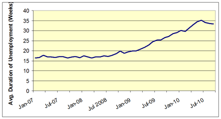
There were a lot of questions yesterday about how many people were being dropped after exceeding their 99 weeks of insurance coverage. The average duration of unemployment has actually dropped a bit, though it's still outrageously high:
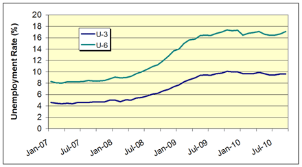
A lot of people have argued that we should be looking at the U-6 number instead of the U-3 number (You can find definitions for the different measures of unemployment here). Here's a comparison between the two measures:
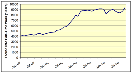
They agree pretty well in terms of trends, except for the little uptick in the last month. This is due to an increase the number of workers forced to take part-time work. Here's a plot of their plight:
The number of people forced into part-time work has increased by 943,000 over the past two months. I noted this last month, but this month was even worse.
October 08, 2010
Unemployment Rate, September 2010
UPDATE: The most important stat in the BLS report is the huge increase in workers forced into part-time work due to economic circumstances. This category has increased by 940,000 people over the past two months.
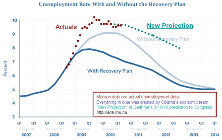
The BLS just released the unemployment rate for last month, and at first blush it's not the most interesting of results. The U-3 unemployment rate last month was 9.6% and this month it's.......9.6%. Here's how that looks on The Chart:
We lost 95K non-farm jobs, but they claim that we added 64K private sector jobs. That doesn't agree well with ADP's announcement that we lost 39,000 jobs last month.
I had many requests for particular graphs yesterday: I'm going to start adding them below the fold as I get to them.
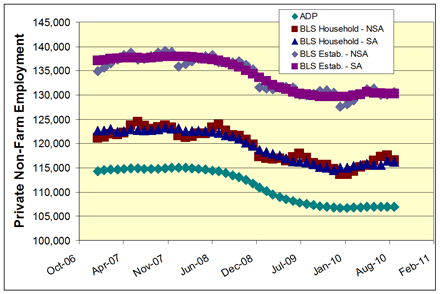
I'll kick off the supplemental charts with a comparison of total private employment estimates from BLS and ADP. The BLS surveys employment in two ways: they poll households ("Household" data) and they survey businesses ("Establishment" data). ADP uses their payroll records to extrapolate to the nation as a whole. Several people also asked about seasonal adjustments, so I included seasonally-adjusted ("SA") and non-seasonally adjusted ("NSA") variants for both BLS surveys.
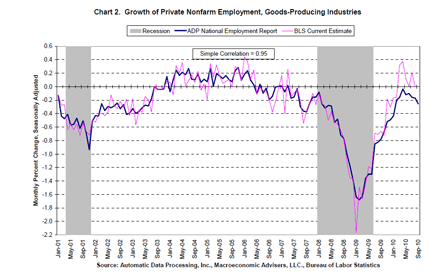
You can see that while they're at different levels, they pretty much follow the same trends, except for the little rise recently in the BLS household data. There's a similar, but smaller rise in the establishment data, and no rise at all in the ADP stats. This is borne out by this chart that I lifted from ADP's September report:
The BLS and ADP month-to-month changes agree pretty well until this past year, when the BLS started showing larger improvements than ADP. Interesting.
But one overall point to note is that non-farm private employment has not continued to fall - it's been at least stable and maybe even slightly positive since the beginning of the year.
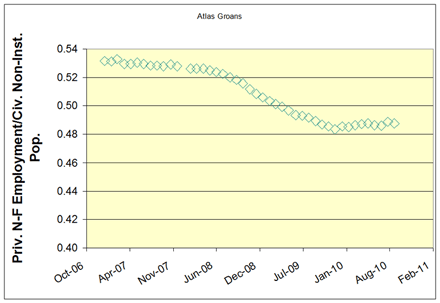
The next chart is one I like to call "Atlas Groans." It's the ratio of private, non-farm employees to the civilian non-institutional population. It's basically a measure of how heavy the burden of supporting government employees and non-workers is on private employers and employees. As you can see, the burden has increased significantly since 2006, but has been stable lately.
There were a lot of questions yesterday about how many people were being dropped after exceeding their 99 weeks of insurance coverage. The average duration of unemployment has actually dropped a bit, though it's still outrageously high:
A lot of people have argued that we should be looking at the U-6 number instead of the U-3 number (You can find definitions for the different measures of unemployment here). Here's a comparison between the two measures:
They agree pretty well in terms of trends, except for the little uptick in the last month. This is due to an increase the number of workers forced to take part-time work. Here's a plot of their plight:
The number of people forced into part-time work has increased by 943,000 over the past two months. I noted this last month, but this month was even worse.
And I think that concludes this month's flurry of charts.
Recent Comments
clarence:
"Hey, Fen.
You posted after I signed off yesterday ..."
m: " Daniel @growing_daniel 12h holy shit they mad ..."
m: "heh Daniel @growing_daniel 7h Bullying works ..."
FenelonSpoke: "And I wanted to tell the story of a very nice enco ..."
AltonJackson: " g'mornin', 'rons ..."
clarence: "Your posts about programming remind me about why I ..."
FenelonSpoke: "And I just learned of this story behind, "I have d ..."
FenelonSpoke: "Thanks very much, Pixy, for the musical selection ..."
clarence: "Rejoinder: Evermore ..."
clarence: "chore coat=freaks+geeks. amarite? ..."
m: ">>>If AI writes your code, why use Python? (Medium ..."
Puddleglum, cheer up for the worst is yet to come: "Mornin' ..."
Recent Entries
Daily Tech News 12 May 2026
Monday Overnight Open Thread (5/11/26)
Someone's Got a Case of the Mondays Cafe
Quick Hits
Washington Post: 42% of Democrats Think the Butler PA Assassination Attempt that Killed One Man Was "Staged"
Unfunny Anti-Childbirth Hag Chelsea Handler Gets Destroyed at Netflix Roast of Kevin Hart
Keir Starmer Vows to Remain in Office for Ten Years, Double Downs on Endless Illegal Immigration, Calls Immigration Reformers "Dangerous" and Warns They Are Taking the UK Down a "Dark Path"
Virginia Democrats Seethe and Scheme to Mass-Fire All Seven Supreme Court Justices to Replace Them With Compliant Communist Operatives, but Senate Leader Says It's No-Go
Be Back Soon
MORNING RANT - The War on Labor Expense: There Never Was a Truck Driver Shortage
Monday Overnight Open Thread (5/11/26)
Someone's Got a Case of the Mondays Cafe
Quick Hits
Washington Post: 42% of Democrats Think the Butler PA Assassination Attempt that Killed One Man Was "Staged"
Unfunny Anti-Childbirth Hag Chelsea Handler Gets Destroyed at Netflix Roast of Kevin Hart
Keir Starmer Vows to Remain in Office for Ten Years, Double Downs on Endless Illegal Immigration, Calls Immigration Reformers "Dangerous" and Warns They Are Taking the UK Down a "Dark Path"
Virginia Democrats Seethe and Scheme to Mass-Fire All Seven Supreme Court Justices to Replace Them With Compliant Communist Operatives, but Senate Leader Says It's No-Go
Be Back Soon
MORNING RANT - The War on Labor Expense: There Never Was a Truck Driver Shortage
Search
Polls! Polls! Polls!
Frequently Asked Questions
The (Almost) Complete Paul Anka Integrity Kick
Primary Document: The Audio
Paul Anka Haiku Contest Announcement
Integrity SAT's: Entrance Exam for Paul Anka's Band
AllahPundit's Paul Anka 45's Collection
AnkaPundit: Paul Anka Takes Over the Site for a Weekend (Continues through to Monday's postings)
George Bush Slices Don Rumsfeld Like an F*ckin' Hammer
Paul Anka Haiku Contest Announcement
Integrity SAT's: Entrance Exam for Paul Anka's Band
AllahPundit's Paul Anka 45's Collection
AnkaPundit: Paul Anka Takes Over the Site for a Weekend (Continues through to Monday's postings)
George Bush Slices Don Rumsfeld Like an F*ckin' Hammer
Top Top Tens
Democratic Forays into Erotica
New Shows On Gore's DNC/MTV Network
Nicknames for Potatoes, By People Who Really Hate Potatoes
Star Wars Euphemisms for Self-Abuse
Signs You're at an Iraqi "Wedding Party"
Signs Your Clown Has Gone Bad
Signs That You, Geroge Michael, Should Probably Just Give It Up
Signs of Hip-Hop Influence on John Kerry
NYT Headlines Spinning Bush's Jobs Boom
Things People Are More Likely to Say Than "Did You Hear What Al Franken Said Yesterday?"
Signs that Paul Krugman Has Lost His Frickin' Mind
All-Time Best NBA Players, According to Senator Robert Byrd
Other Bad Things About the Jews, According to the Koran
Signs That David Letterman Just Doesn't Care Anymore
Examples of Bob Kerrey's Insufferable Racial Jackassery
Signs Andy Rooney Is Going Senile
Other Judgments Dick Clarke Made About Condi Rice Based on Her Appearance
Collective Names for Groups of People
John Kerry's Other Vietnam Super-Pets
Cool Things About the XM8 Assault Rifle
Media-Approved Facts About the Democrat Spy
Changes to Make Christianity More "Inclusive"
Secret John Kerry Senatorial Accomplishments
John Edwards Campaign Excuses
John Kerry Pick-Up Lines
Changes Liberal Senator George Michell Will Make at Disney
Torments in Dog-Hell
Greatest Hitjobs
The Ace of Spades HQ Sex-for-Money Skankathon
A D&D Guide to the Democratic Candidates
Margaret Cho: Just Not Funny
More Margaret Cho Abuse
Margaret Cho: Still Not Funny
Iraqi Prisoner Claims He Was Raped... By Woman
Wonkette Announces "Morning Zoo" Format
John Kerry's "Plan" Causes Surrender of Moqtada al-Sadr's Militia
World Muslim Leaders Apologize for Nick Berg's Beheading
Michael Moore Goes on Lunchtime Manhattan Death-Spree
Milestone: Oliver Willis Posts 400th "Fake News Article" Referencing Britney Spears
Liberal Economists Rue a "New Decade of Greed"
Artificial Insouciance: Maureen Dowd's Word Processor Revolts Against Her Numbing Imbecility
Intelligence Officials Eye Blogs for Tips
They Done Found Us Out, Cletus: Intrepid Internet Detective Figures Out Our Master Plan
Shock: Josh Marshall Almost Mentions Sarin Discovery in Iraq
Leather-Clad Biker Freaks Terrorize Australian Town
When Clinton Was President, Torture Was Cool
What Wonkette Means When She Explains What Tina Brown Means
Wonkette's Stand-Up Act
Wankette HQ Gay-Rumors Du Jour
Here's What's Bugging Me: Goose and Slider
My Own Micah Wright Style Confession of Dishonesty
Outraged "Conservatives" React to the FMA
An On-Line Impression of Dennis Miller Having Sex with a Kodiak Bear
The Story the Rightwing Media Refuses to Report!
Our Lunch with David "Glengarry Glen Ross" Mamet
The House of Love: Paul Krugman
A Michael Moore Mystery (TM)
The Dowd-O-Matic!
Liberal Consistency and Other Myths
Kepler's Laws of Liberal Media Bias
John Kerry-- The Splunge! Candidate
"Divisive" Politics & "Attacks on Patriotism" (very long)
The Donkey ("The Raven" parody)

